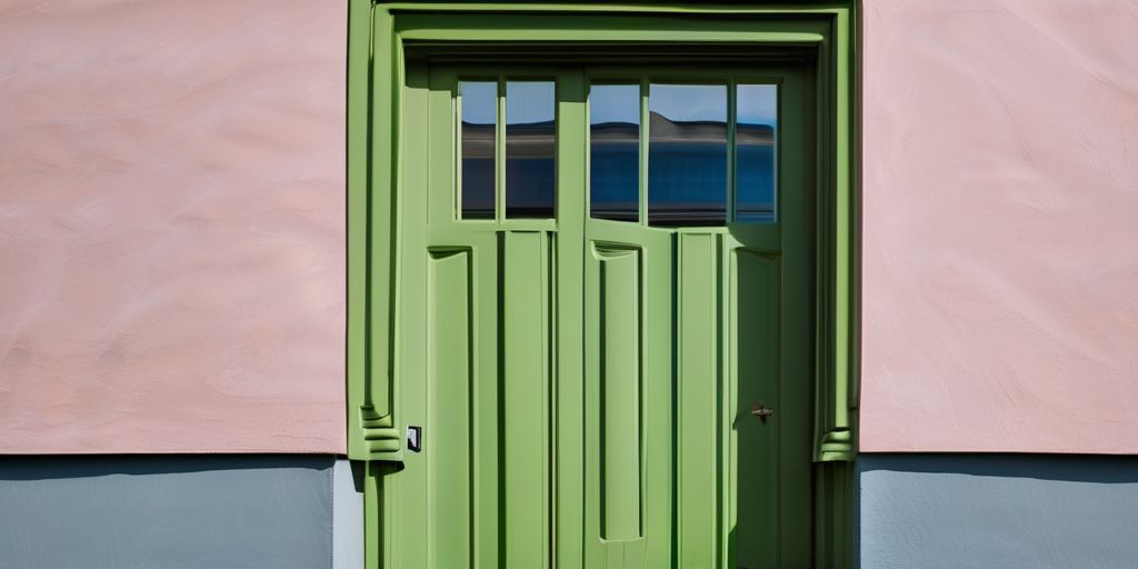
Picking the right exterior house colors for 2024 can feel like a big deal. It’s not just about what looks good now—it’s about finding something you’ll still love in a few years. From trending shades to timeless combos, there’s a lot to think about. This guide will break it all down, so you can make a choice you won’t regret.
Key Takeaways
- Warm, earthy tones and muted pastels are trending for 2024.
- Always consider your home’s architecture and surroundings when picking colors.
- Testing paint samples on your house can save you from costly mistakes.
- Eco-friendly paints are better for the environment and your health.
- Finishes like matte or glossy can totally change how a color looks.
Trending Exterior House Colors for 2024
Warm Earth Tones to Watch
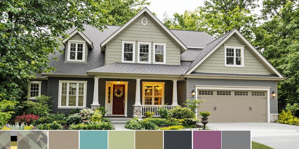
Earthy colors are making a big splash in 2024. These tones feel cozy and grounded, perfect for creating a welcoming vibe. Some popular choices include:
- Terracotta or clay-inspired shades
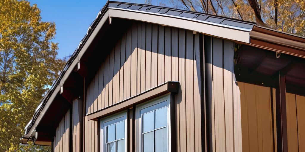
- Warm, muted browns with a hint of gray
- Olive greens that mimic natural surroundings
These colors pair beautifully with natural materials like wood or stone. For example, a Burlington home near Lake Champlain might look stunning with a terracotta exterior complemented by wood accents.
The Rise of Muted Pastels
Muted pastels are stepping into the spotlight this year. They offer a subtle charm without being overpowering. You might see homes painted in shades like:
- Dusty rose or blush pink
- Soft lavender with gray undertones
- Pale mint green that feels fresh yet understated
These colors work well for homes with modern or cottage-style architecture. They also blend nicely with white or off-white trim for a clean, polished look.
Bold and Dark Shades Making a Statement
For those who want their home to stand out, bold and dark shades are a go-to choice. Deep and dramatic hues can add a modern, sophisticated feel. Trending options include:
- Deep navy blue
- Charcoal gray or almost-black tones
- Forest green for a lush, rich aesthetic
Using these shades with contrasting trims or lighter accents can create a striking effect. For example, pairing charcoal gray siding with crisp white trim can make a home look sharp and contemporary.
Don’t shy away from experimenting with these trending colors. They’re a great way to reflect your personality while keeping your home stylish and inviting.
How to Choose the Perfect Exterior Color Palette
Considering Your Home’s Architecture
When selecting exterior colors, your home’s architectural style is a great starting point. Traditional homes often look best with classic shades like whites, grays, or muted blues, while modern designs can handle bolder options. Think of the architecture as a guide—it’s your framework for narrowing down choices.
Here’s a quick breakdown of popular styles and matching palettes:
| Home Style | Suggested Colors |
|---|---|
| Colonial | White, navy, forest green |
| Mid-Century Modern | Earth tones, muted pastels |
| Craftsman | Deep greens, browns, beige |
| Victorian | Soft pastels, rich jewel tones |
Blending with the Neighborhood Aesthetic
Your home doesn’t exist in a bubble—it’s part of a larger community. A color that looks stunning on its own might clash with nearby houses. Walk around the neighborhood and observe common themes. Are homes leaning toward neutral tones, or is there a mix of vibrant colors?
- Match: If most homes are neutral, consider a similar palette.
- Complement: Choose a color that pairs well without matching exactly.
- Stand Out: Opt for a bold shade, but keep it tasteful.
In Burlington, for example, homes near Battery Park often feature earthy tones that echo the natural surroundings. A warm beige or olive green might be a perfect fit.
Factoring in Climate and Lighting
Colors can look completely different depending on the light and weather conditions. A sunny climate may wash out pale shades, making them appear almost white, while darker colors can absorb too much heat. On the flip side, in cloudy or cooler areas, bright or warm tones can make a home feel more inviting.
Key tips:
- Test paint samples on different sides of your home.
- Observe how they look at various times of the day.
- Take into account seasonal changes in lighting.
A color that seems perfect in the store might look entirely different under natural light. Always test before committing.
By considering these factors, you’ll create a palette that not only enhances your home but also feels right for its environment.
Popular Color Combinations for Modern Homes
Pairing Neutrals with Accents
Neutral tones like beige, gray, or soft white are timeless choices for modern homes. What makes them stand out is how well they pair with bold accent shades. You can add a pop of color to doors, shutters, or even trim to create a balanced yet eye-catching look.
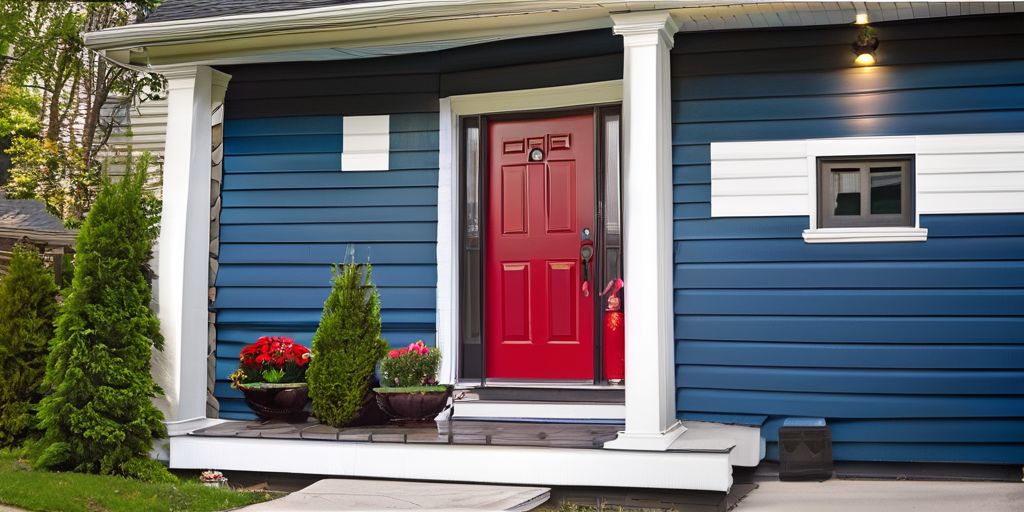
- Combine warm gray siding with a vibrant red door for a striking contrast.
- Pair off-white walls with navy blue shutters for a coastal-inspired aesthetic.
- Use taupe siding and mustard yellow accents for a subtle, modern twist.
Using Contrasting Trim for Impact
Contrasting trim is an excellent way to emphasize your home’s architectural features. It works especially well for homes with intricate details or unique shapes.
- Dark trim on a light-colored house creates a bold, modern vibe.
- Opt for a black-and-white palette for a clean, timeless design.
- Experiment with deep green trim against a neutral base for a nature-inspired look.
Consider how the trim color interacts with natural light throughout the day—it can dramatically change the overall feel.
Incorporating Natural Materials into the Palette
Blending natural materials like stone or wood into your exterior color scheme adds texture and depth. These elements can either complement or contrast with your paint choices.
- Pair cedar siding with earthy green tones for a harmonious, organic look.
- Use stonework in gray or beige alongside muted pastel walls for a soft, elegant combination.
- Highlight wooden accents with neutral paint to let the material’s natural beauty shine.
Tables can also help organize ideas when you’re deciding on combinations. Here’s a simple example:
| Material | Suggested Color Pairing |
|---|---|
| Cedar Wood | Earthy Greens, Soft Browns |
| Gray Stone | Muted Blues, Light Grays |
| Brick | Cream Whites, Warm Terracottas |
When selecting combinations, think about your surroundings. For instance, homes near Lake Champlain in Burlington might benefit from palettes inspired by the lake’s blues and greens, blending seamlessly with the natural landscape.
Mistakes to Avoid When Selecting Exterior Colors
Ignoring the Roof and Other Fixed Elements
When choosing exterior colors, it’s easy to focus solely on the walls and forget about the roof, brickwork, or other permanent features. These elements set the tone for your color palette and can make or break your design. For example:
- A red brick foundation pairs better with neutral or muted tones than bold, clashing shades.
- Dark roofs often work well with lighter walls to create contrast.
- Stone features may call for earthy hues to maintain harmony.
Always consider these fixed elements as part of a cohesive plan, not as afterthoughts.
Overlooking the Importance of Samples
Paint swatches and online images can be deceiving. A color that looks perfect in a store or on a screen might appear completely different under natural light or against your home’s texture. To avoid disappointment:
- Test multiple paint samples on your exterior walls.
- Observe the colors at different times of the day.
- Pay attention to how lighting and shadows affect the look.
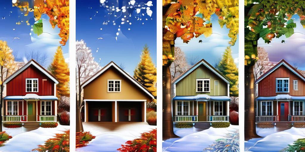
Burlington’s changing seasons, for instance, can dramatically alter how colors appear, especially with snow or lush greenery as backdrops.
Choosing Colors Based on Trends Alone
Trends come and go, but your home’s exterior will be there for years. While it’s tempting to go for the latest popular shade, ask yourself:
- Does this color suit my home’s architecture?
- Will it blend with the neighborhood aesthetic?
- Is it practical for maintenance and longevity?
Instead of chasing fleeting trends, aim for a timeless palette that you’ll love long-term. For example, choosing bold vinyl siding colors can be exciting, but it’s crucial to balance vibrancy with practicality.
The Role of Finishes in Enhancing Exterior Colors
Matte vs. Glossy: What Works Best
Choosing between matte and glossy finishes is more than just a style decision. Each finish has its own strengths and weaknesses, and what works for one home might not suit another.
- Matte finishes are subtle and understated, perfect for creating a warm, natural look. They’re great for hiding surface imperfections but may require more maintenance in areas with harsh weather.
- Glossy finishes offer a sleek, polished appearance and are easier to clean. However, they can highlight flaws on uneven surfaces and might reflect too much light in sunny areas.
When selecting a sheen for painted brick homes, consider environmental factors like climate and durability. The wrong choice could lead to frequent reapplications or diminished curb appeal, so think about long-term satisfaction.
How Textures Influence Color Perception
The texture of your exterior surfaces can completely change how a color looks. For example:
- Smooth surfaces reflect more light, making colors appear brighter and more vibrant.
- Rough or textured surfaces, like stucco, absorb light, giving colors a muted, earthy tone.
- Wood grains can add depth and variation to stains, enhancing their natural appeal.
If you’re working with materials like brick, remember that the texture can also interact with the paint’s sheen. For instance, a glossy finish on rough brick might create an uneven shine, while a matte finish could provide a more consistent look.
Using Stains and Washes for a Unique Look
Stains and washes are excellent for those who want to showcase the natural beauty of materials like wood or brick. Unlike opaque paints, these finishes allow the underlying material to shine through, adding depth and character.
- Stains are ideal for wood, enhancing the grain and providing a more natural appearance.
- Lime washes or whitewashes can soften the look of brick, creating a timeless, weathered effect.
- Semi-transparent washes work well on stone, offering a subtle tint while maintaining the material’s texture.
When selecting a finish for brick, think about balancing aesthetics and durability. A poorly chosen finish can detract from the home’s charm or lead to quicker wear and tear. Stains and washes are particularly effective for blending modern updates with historic architecture.
A quick visit to Burlington’s historic Church Street Marketplace can inspire creative use of finishes. The mix of matte, glossy, and textured surfaces in its iconic buildings showcases how thoughtful choices can make a lasting impression.
Eco-Friendly Paint Options for 2024
Low-VOC and Non-Toxic Paints
If you’re thinking about giving your home a fresh coat of paint, eco-friendly options should definitely be on your radar. Low-VOC (volatile organic compounds) and non-toxic paints are becoming the go-to choices for many homeowners. Why? Because they’re better for your health and the environment. VOCs are chemicals that evaporate into the air and can cause everything from mild headaches to more serious health issues over time. Paints with low or zero VOCs help reduce indoor air pollution without sacrificing quality.
Here are a few benefits of choosing low-VOC or non-toxic paints:
- Improved air quality inside your home.
- Safer for families, especially kids and pets.
- Reduced environmental impact during manufacturing.
When picking a paint, check the label for certifications that confirm it’s truly eco-friendly. Don’t just rely on marketing buzzwords—dig into the details.
Sustainable Color Choices
Choosing sustainable colors isn’t just about aesthetics; it’s about making thoughtful decisions that align with environmental values. Earthy tones like soft greens, browns, and neutral grays are often made with eco-conscious pigments and tend to blend beautifully with natural surroundings. Muted pastels are also trending in 2024 and can be a great way to brighten your exterior without overwhelming the landscape.
Some tips for sustainable color selection:
- Opt for shades that complement your home’s natural surroundings.
- Consider timeless hues to reduce the need for frequent repainting.
- Look for paints made with natural or recycled materials.
If you’re in the Burlington area, think about how your home’s exterior might harmonize with local landmarks like the earthy tones of the Green Mountains or the soft blues of Lake Champlain.
Durability and Environmental Impact
Eco-friendly paints aren’t just kind to the planet—they’re also designed to last. Long-lasting paints mean fewer touch-ups and repaints, which reduces waste over time. Durability is key when you’re investing in a sustainable paint option. Look for formulas that are weather-resistant and offer good coverage, especially if you’re painting aluminum siding or other materials that face harsh outdoor conditions.
Here’s a quick breakdown:
| Feature | Why It Matters |
|---|---|
| Weather resistance | Protects against rain and sun. |
| UV protection | Prevents colors from fading. |
| Easy maintenance | Reduces the need for cleaning. |
For aluminum siding specifically, eco-friendly paints provide excellent protection against UV rays and harsh weather. Learn more about durable eco-friendly paints for aluminum siding to ensure your exterior stays beautiful for years to come.
Making the switch to eco-friendly paints isn’t just a trend—it’s a step toward a healthier home and a healthier planet. Small changes, like choosing sustainable paints, can make a big difference over time.
Inspiration from Iconic Homes and Designers
Classic Color Schemes That Stand the Test of Time
Some color combinations never go out of style. These timeless palettes often draw inspiration from nature and historical architecture. Here are a few examples:
- White with Black Trim: A crisp, clean look that works on almost any home style.
- Beige or Taupe with Olive Green Accents: Perfect for blending into natural surroundings.
- Deep Red and Cream: A bold yet classic pairing often seen on colonial-style homes.
These combinations not only age gracefully but also offer flexibility when updating other exterior elements like landscaping or roofing.
Modern Takes on Traditional Palettes
While classic schemes are enduring, modern interpretations can give them a fresh twist. Consider these ideas:
- Pairing traditional neutral bases with vibrant pops of color, like a navy-blue door on a gray house.
- Using monochromatic schemes with varying shades of one color for a sleek, minimalist vibe.
- Incorporating metallic finishes, such as copper or bronze, for a contemporary edge.
For example, homes in the Burlington area could experiment with muted blues and grays to complement the natural beauty of Lake Champlain.
Lessons from Renowned Exterior Designers
Designers often emphasize the importance of context when choosing colors. Here’s what you can learn:
- Highlight Architectural Features: Use contrasting colors to draw attention to unique elements like gables or columns.
- Blend with the Environment: Earthy tones or muted shades can help your home harmonize with its surroundings.
- Experiment with Texture: Combining smooth and rough finishes can add depth and interest to your exterior.
The exterior color of a home isn’t just about aesthetics—it’s a reflection of its character and the people who live there. Take inspiration from iconic designs, but don’t be afraid to make it your own.
Looking for ideas to refresh your home? Take a cue from famous homes and designers who have transformed spaces into stunning works of art. Whether it’s a splash of color or a complete makeover, inspiration is everywhere! Visit our website to discover how we can help you bring your vision to life with our expert painting services. Don’t wait—let’s get started on your dream home today!
Wrapping It Up
Picking the right color for your house can feel like a big deal, but it doesn’t have to be stressful. Take your time, think about what feels right for your home, and don’t be afraid to try something new. Trends come and go, but what really matters is that you love how your house looks. At the end of the day, it’s your space, and it should make you happy every time you pull into the driveway. So grab those paint samples, trust your gut, and have fun with it!
Frequently Asked Questions
What are the most popular exterior house colors for 2024?
For 2024, warm earth tones, soft muted pastels, and bold dark shades are trending. These colors can give your home a fresh and stylish look.
How do I pick the right exterior color for my house?
Start by considering your home’s style, the neighborhood’s vibe, and how light and weather affect colors in your area. Samples can help you see how colors will really look.
Can I mix neutral colors with bold accents?
Yes, pairing neutral shades with bold accent colors is a great way to make your home stand out while still looking balanced and modern.
Why is it important to test paint samples?
Testing samples helps you see how the colors look in different lighting and weather. This can prevent costly mistakes and ensure you love the final result.
Are there eco-friendly paint options available?
Yes, you can choose low-VOC or non-toxic paints. These are better for the environment and safer for your family.
Should I follow color trends or stick to classic choices?
It depends on your style. Trends can make your home look current, but classic colors often age better and stay in style longer.

