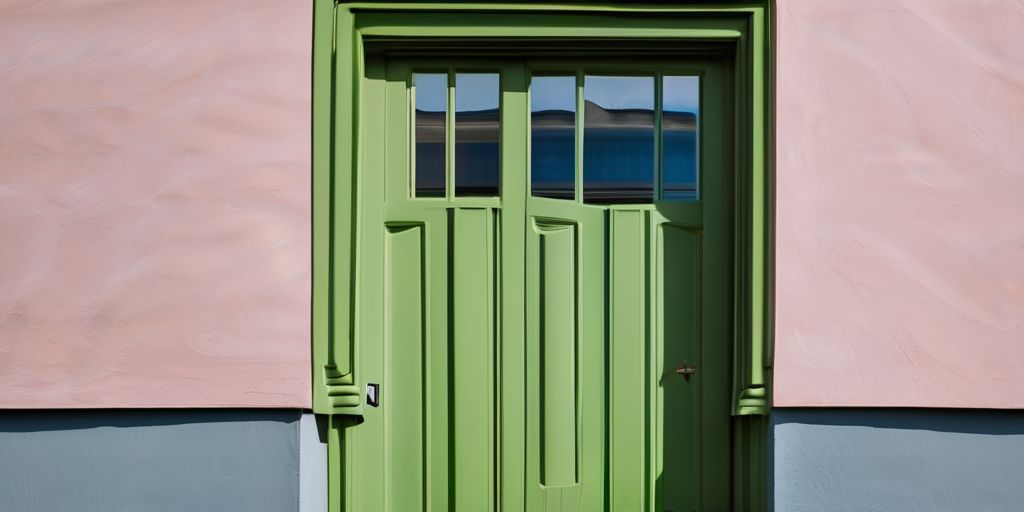
This article explores the various styles and color choices used in exterior house painting throughout history. Each period brought unique aesthetics and techniques that reflect the cultural and artistic values of the time. From the earthy tones of the Colonial period to the vibrant colors of the Victorian era, understanding these styles can help homeowners make informed decisions when painting their historic homes.
Key Takeaways
- Colonial houses often used natural pigments for earthy colors, with simple two-color schemes.
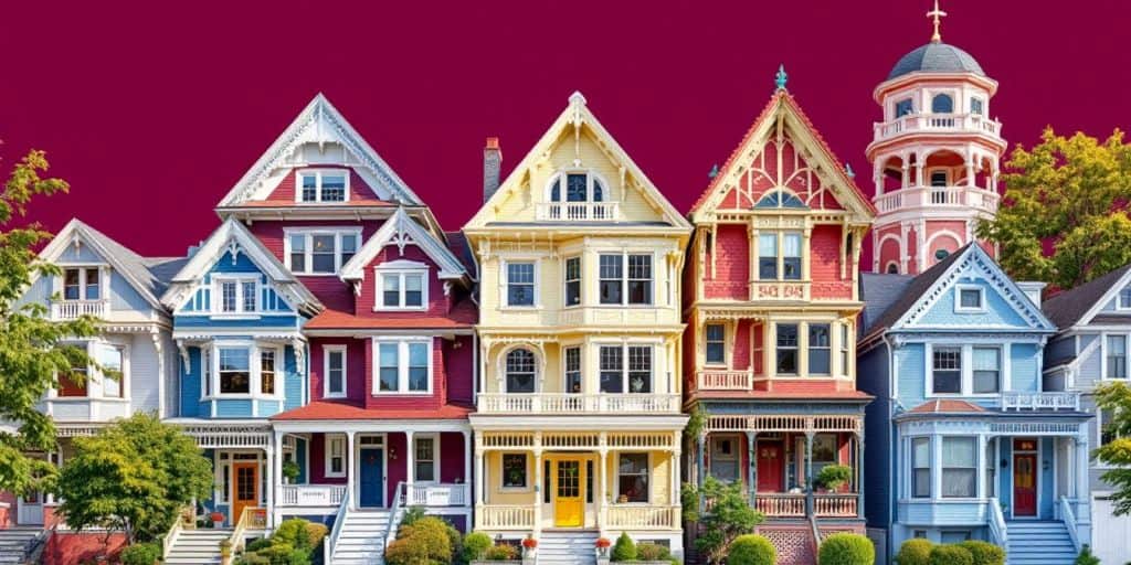
- Victorian homes embraced bold colors and three-color schemes, reflecting a move towards more vibrant aesthetics.
- The Federal period favored lighter shades, moving away from the darker colors of earlier styles.
- Greek Revival houses typically featured white or off-white bodies with green or black trim, creating a classic look.
- Modern interpretations of historical styles blend old and new, requiring careful color selection for authenticity.
Colonial Period House Painting Styles
Color Palette and Materials
During the Colonial period, the color palette was quite limited, primarily due to the availability of natural materials. Here are some key points about the colors used:
- Earthy tones were predominant, including shades of red, brown, and ochre.
- Natural pigments derived from minerals and plants were commonly used.
- The body of the house was often left unpainted or stained to showcase the natural wood.
Body, Trim, and Sash
The three main elements of Colonial houses were the body, trim, and sash:
- Body: Typically made of clapboard or shingles, often in dark brown or chocolate tones.
- Trim: Usually painted in contrasting colors like Indian red or Spanish brown.
- Sash: Movable elements like doors and windows were often painted in darker shades to stand out.
Influence of Natural Pigments
The use of natural pigments greatly influenced the aesthetics of Colonial homes:
- Colors were derived from local materials, making them unique to each region.
- The palette reflected the environment, blending with the landscape.
- Natural pigments provided a sense of harmony with the surroundings, enhancing the home’s character.
The Colonial period was a time when paint was not just about aesthetics; it was about expressing identity and connecting with the environment.
In summary, the Colonial period’s painting styles were characterized by a limited yet rich color palette, a focus on natural materials, and a strong connection to the environment. This laid the groundwork for future architectural styles and their respective color choices.
Federal Period House Painting Styles
Evolution from Georgian Styles
The Federal period, spanning from 1780 to 1830, marked a shift in house painting styles. Lighter colors became the trend, moving away from the bold hues of the Georgian era. Here are some key points about this evolution:
- Transition to softer, more elegant colors.
- Emphasis on symmetry and proportion in design.
- Use of natural pigments for a refined look.
Popular Colors and Combinations
During the Federal period, the color palette was characterized by:
- Whites and creams: These were the most fashionable choices.
- Pale shades of gray and ochre were also popular.
- Darker colors like green and black were used for accents, especially on doors and shutters.
| Color Type | Examples |
|---|---|
| Body Colors | White, Cream, Straw |
| Trim Colors | White, Same as Body Color |
| Accent Colors | Dark Green, Black |
Regional Variations
Different regions showcased unique interpretations of Federal colors:
- Urban areas often favored lighter, more expensive colors.
- Rural houses typically remained unpainted until later in the 19th century.
- Some homes featured contrasting colors on the front and back, reflecting local tastes.
The Federal period’s focus on lighter colors and elegant designs set the stage for future architectural styles, influencing how homes were painted for generations to come.
This period not only defined a style but also represented a cultural shift towards more refined aesthetics in American architecture. The Federal style, also known as Adam style in America, was heavily influenced by the English Adamesque style, showcasing a blend of elegance and simplicity that remains admired today.
Georgian Period House Painting Styles
Symmetry and Proportions
The Georgian period, spanning from 1725 to 1780, is known for its symmetrical designs and classical proportions. This architectural style emphasized balance and harmony, which was reflected in the choice of colors and materials used for painting houses. Georgian homes often featured strong colors derived from natural pigments, creating a striking appearance.
Color Choices and Techniques
During this time, the color palette was quite diverse. Here are some common choices:
- Body Colors: Dark stone colors, such as chocolates, ochres, and greys.
- Trim Colors: Almost always white, but with a softer, yellower tone than today’s bright whites.
- Door Colors: Typically dark shades like chocolate, red, green, or blue.
The use of these colors helped to highlight the architectural features of the homes, making them stand out in their surroundings.
Impact on Modern Styles
The Georgian style has had a lasting influence on modern architecture and painting styles. Many contemporary homes still draw inspiration from the symmetry and color choices of this period. The principles of color harmony established during the Georgian era continue to guide homeowners today.
The Georgian period set the stage for future architectural styles, blending beauty with functionality.
In summary, the Georgian period was marked by a thoughtful approach to color and design, emphasizing both aesthetic appeal and structural integrity. Understanding these historical choices can help us appreciate the beauty of our homes today.
Victorian Period House Painting Styles
Early Victorian Colors
During the early Victorian era (1840-1870), houses often showcased a mix of styles, with the Italianate and Gothic Revival being particularly popular. The paint colors were still influenced by the previous Federal period, using natural pigments mixed with white lead and linseed oil. Common colors included:
- Earthy tones: Soft browns, grays, and muted greens.
- Lighter shades: Used for smaller homes, creating a lively appearance.
- Darker colors: Reserved for larger houses, giving them a dignified look.
Late Victorian Innovations
As the Victorian period progressed (1870-1900), a shift occurred towards more vibrant and diverse colors. The introduction of mass-produced paints allowed for:
- Three-color schemes: Typically, one color for the body, a second for the trim, and a darker shade for the sash.
- New pastels: Colors like rose, peach, and olive became popular.
- Stronger contrasts: Homeowners began to favor bold combinations, enhancing the visual appeal of their homes.
Three-Color Schemes
The three-color scheme became a hallmark of Victorian painting styles. Here’s a simple breakdown:
| Element | Common Colors |
|---|---|
| Body | Light to mid-tone colors (e.g., buff, cream) |
| Trim | Darker shades (e.g., deep green, burgundy) |
| Sash | Darkest color (e.g., black, dark brown) |
The Victorian era was a time of creativity and expression in home design, where color choices reflected personal taste and societal trends.
In summary, the Victorian period was marked by a rich palette and innovative painting techniques that set the stage for modern styles. The use of color not only enhanced the beauty of homes but also showcased the individuality of their owners.
Greek Revival House Painting Styles
Traditional Color Palette
During the Greek Revival period (1825-1860), the color choices for houses were quite traditional. Homeowners often opted for:
- White or off-white bodies
- Earthy stone colors like greys and tans
- Ochres and yellows for a warm touch
This palette aimed to reflect the elegance of ancient Greek architecture, emphasizing simplicity and harmony.
Common Exterior Combinations
The most popular color scheme during this time was:
- Body: White or off-white
- Doors and Shutters: Green
- Sash: Black
This combination created a striking yet classic look that many homeowners cherished.
Influence on Later Styles
The Greek Revival style had a lasting impact on future architectural trends. Its emphasis on clean lines and natural colors paved the way for:
- More vibrant color palettes in later periods
- The use of contrasting colors in trim and sash
- A shift towards incorporating natural pigments in paint
The Greek Revival period set a foundation for how colors and styles would evolve in American architecture, blending tradition with emerging trends.
Second Empire and Mansard Styles
Urban Aesthetic
The Second Empire and Mansard styles emerged in the mid-19th century, showcasing a unique urban aesthetic. These homes often featured:
- Distinctive rooflines with steep slopes and dormer windows.
- A blend of historical influences, particularly from French architecture.
- Decorative elements like cornices and brackets that added character.
Color Theory in Practice
During this period, color choices were influenced by evolving color theory. Here are some key points:
- Body Colors: Commonly used neutral tones such as grays, tans, and warm beiges.
- Trim Colors: Darker shades were preferred, often contrasting with the body color.
- Sash Colors: Typically matched the trim, creating a cohesive look.
| Color Type | Common Choices |
|---|---|
| Body | Grays, Tans, Ochers |
| Trim | Darker shades (e.g., dark green, brown) |
| Sash | Same as trim |
Popular Pigments
The pigments used during this time were varied and vibrant. Some popular choices included:
- Deep russets and olives for a rich appearance.
- Gray-greens and ochers for a more subdued look.
- Strong contrasts became fashionable, leading to striking combinations.
The Second Empire style reflects a time when color choices were guided by color theory, enhancing the overall visual appeal of homes.
This period marked a shift towards more formal and urban designs, making it a significant chapter in the history of house painting styles.
Queen Anne Style House Painting
Decorative Elements
The Queen Anne style, popular from 1880 to 1915, is known for its variety and irregularity. This architectural style features:
- Complex shapes and massing of building elements
- Decorative motifs, often made from molded materials
- A mix of clapboards and shingles, sometimes cut into unique shapes
Bold Color Choices
When it comes to colors, Queen Anne homes often used:
- Strong, rich colors for the body, typically different for clapboards and shingles
- A unifying trim color that complements the body colors
- Darker shades for sash, doors, and shutters, such as deep green or maroon
Influence of Mass-Produced Paints
The introduction of mass-produced paints during this period allowed for:
- A wider range of colors, including new pastels and deeper tones
- The use of three-color schemes, which became the norm:
- One color for the body
- A second for the trim
- The darkest color for sash and decorative features
The Queen Anne style is a celebration of color and creativity, making each home a unique expression of its owner’s taste.
In summary, Queen Anne homes are characterized by their decorative elements, bold color choices, and the influence of mass-produced paints, creating a vibrant and inviting exterior.
Shingle Style House Painting
Naturalistic Colors
Shingle style houses are known for their naturalistic appearance, which means the colors used should reflect the beauty of nature. Here are some common color choices:
- Body Colors: Dark brown stains or paints, dark olives, gray-browns, and dark greens.
- Trim Colors: Beige or tan to complement the body, or a darker contrasting color like dark green or maroon.
- Sash and Doors: Typically painted in dark shades to maintain a cohesive look.
Integration with Landscape
The design of shingle style homes emphasizes harmony with their surroundings. This means:
- Using colors that blend with the natural environment.
- Choosing shades that enhance the home’s architectural features.
- Ensuring that the overall look feels inviting and warm.
Common Trim and Sash Colors
When selecting trim and sash colors, consider the following:
- Contrast: Darker colors for sash and doors create a striking contrast against lighter body colors.
- Consistency: Keeping trim colors in the same family as the body color helps maintain a unified appearance.
- Historical Accuracy: It’s important to choose colors that reflect the historical context of the home.
Remember: The goal is to create a beautiful, cohesive look that respects the home’s architectural style while blending seamlessly with the environment.
In summary, shingle style house painting focuses on earthy tones and natural colors that enhance the home’s rustic charm. By carefully selecting your color palette, you can achieve a stunning exterior that stands the test of time. Avoid overly bright colors that clash with the natural aesthetic.
Stick Style House Painting
Structural Expression
The Stick Style, popular from 1860 to 1890, is known for its unique use of flat trim boards. These boards create distinct sections on clapboarded walls, giving the house a geometric look. This style emphasizes the structure itself, showcasing craftsmanship.
Color Harmony
When it comes to colors, Stick Style homes often feature:
- Vibrant contrasts: Bright colors like yellow paired with dark green.
- Rich combinations: Dark red with olive or light and dark gray-green.
- Sash and doors: Typically dark shades like deep red or maroon, often combined with traditional dark green or black.
Regional Preferences
Different regions may have their own preferences for Stick Style colors. Here are some common choices:
- Northeast: Darker, richer colors to match the landscape.
- West Coast: Lighter, more natural tones that blend with the environment.
- Midwest: A mix of both, often using earthy colors that reflect local materials.
Stick Style houses are a beautiful blend of form and color, making them stand out in any neighborhood.
In summary, the Stick Style is not just about aesthetics; it reflects a time when architecture was celebrated for its craftsmanship and creativity. Understanding these elements can help you appreciate the beauty of these historic homes.
Edwardian Period House Painting Styles
Contrast with Victorian Styles
The Edwardian period, which followed the Victorian era, brought a fresh approach to house painting. Unlike the Victorian preference for darker colors, Edwardian homes often featured a lighter trim against a darker body color. This shift created a more balanced and inviting appearance. Here are some key points about this style:
- Body Colors: Common choices included mid-tone to dark shades like Dunbar Buff and Edwardian Cream.
- Trim Colors: Lighter shades such as Oxford Ivory and Classical White were popular, providing a nice contrast.
- Window Sash: Typically dark or black, enhancing the overall aesthetic.
Color Placement and Techniques
In the Edwardian era, the placement of colors was crucial. The aim was to create a harmonious look that was both stylish and functional. Here’s how it was typically done:
- Body: The main walls were painted in rich, darker tones.
- Trim: Lighter colors were used for decorative elements, making them stand out.
- Sash: Dark colors were applied to window frames and doors, tying the look together.
Popular Exterior Colors
The Edwardian palette was diverse, allowing homeowners to express their individuality. Some popular colors included:
- Body:
- Dunbar Buff
- Edwardian Cream
- Strathcona Gold
- Trim:
- Oxford Ivory
- Craftsman Cream
- Pendrell Cream
- Sash:
- Comox Green
- Gloss Black
The Edwardian style emphasized a balance between light and dark, creating a welcoming atmosphere for homes.
This period marked a significant change in how colors were used in house painting, moving towards a more refined and elegant aesthetic that still resonates today.
Highlights
- Body, Trim, and Sash: The three main elements of house painting.
- Color Harmony: Achieving balance through color choices.
Craftsman Style House Painting
Emphasis on Natural Materials
Craftsman style homes are known for their connection to nature. The use of natural materials is key in this style, which often includes:
- Wood siding
- Stone accents
- Earthy colors that blend with the environment
The goal is to create a harmonious look that feels organic and inviting.
Earthy Color Palette
The color choices in Craftsman homes are typically soft and muted. Here are some common colors:
- Olive green
- Warm browns
- Deep reds
These colors help the house to blend in with its surroundings, making it feel like a part of the landscape.
Trim and Sash Details
In Craftsman homes, the trim and sash are often painted in darker shades than the body color. This creates a pleasing contrast. Here are some typical combinations:
- Body: Light beige, Trim: Dark brown
- Body: Soft green, Trim: Dark olive
- Body: Warm gray, Trim: Charcoal
The beauty of Craftsman style lies in its simplicity and connection to nature.
Conclusion
When choosing colors for a Craftsman home, consider the natural environment and aim for a palette that feels warm and inviting. An exterior painter familiar with this style can help you achieve the perfect look.
Remember, the goal is to create a home that feels like it belongs in its setting, using colors and materials that reflect the beauty of nature.
Highlight
Craftsman-style stained glass is characterized by simple geometric patterns and nature-inspired motifs. These windows often feature earthy colors and depictions that enhance the overall aesthetic of the home.
Modern Interpretations of Historical Styles
In today’s world, many homeowners are looking to blend historical charm with modern aesthetics. This approach not only honors the past but also creates a unique and inviting atmosphere. Here are some key aspects to consider:
Blending Old and New
- Mixing styles: Combine elements from different historical periods to create a cohesive look.
- Modern materials: Use contemporary materials that mimic traditional styles, such as fiber cement siding that resembles wood.
- Innovative techniques: Explore new painting techniques that enhance the historical features of your home.
Choosing Authentic Colors
- Research historical palettes: Look into the color schemes used during the period your home was built.
- Consider the environment: Choose colors that complement the natural surroundings of your home.
- Use color psychology: Understand how colors can affect mood and curb appeal, as highlighted in the study of color psychology.
Preservation Tips
- Maintain original features: Keep the original trim and sash colors to preserve the home’s character.
- Regular maintenance: Ensure that the paint is in good condition to protect the underlying materials.
- Consult experts: Seek advice from professionals who specialize in historical homes to ensure authenticity.
Remember, the goal is to create a home that feels fresh and beautiful while respecting its historical roots.
By thoughtfully combining historical styles with modern elements, you can create a home that is both timeless and contemporary. Embrace the journey of making your house a true reflection of your personal style!
In today’s world, many people are rethinking how they use old styles in new ways. This means taking classic designs and giving them a fresh twist that fits modern tastes. If you’re curious about how to update your home with these exciting ideas, visit our website for more information!
Conclusion
In wrapping up our journey through the history of house painting styles and colors, it’s clear that each era brought its own unique flair and choices. From the earthy tones of the Colonial period to the vibrant hues of the Victorian age, the colors we choose for our homes tell a story. They reflect not just personal taste, but also the cultural and historical influences of their time. As you consider painting your own home, remember that you’re not just picking colors; you’re connecting with a rich tradition that spans centuries. So, whether you opt for a classic look or something more modern, let your choices celebrate the beauty and history of architecture.
Frequently Asked Questions
What are the main painting styles from the Colonial period?
During the Colonial period, houses were often painted using earthy colors. The walls, known as the body, were usually a dark brown or chocolate color, while the trim was often painted in contrasting colors like Indian red.
How did Federal period colors differ from Georgian styles?
Federal period colors were lighter and included shades like white and cream, moving away from the bolder colors of Georgian styles. This period favored softer tones, often with lighter trims.
What colors were popular during the Victorian period?
In the Victorian period, colors became much more varied. Early on, darker, dignified colors were used, but later, brighter colors like pastels became popular. Many homes featured three-color schemes.
What is the significance of color in Greek Revival architecture?
Greek Revival homes typically used traditional colors like white or stone shades. The most common color scheme was a white body with green doors and black sash.
How did the Second Empire style influence color choices?
The Second Empire style saw a mix of neutral colors like grays and tans in the early years, but as time went on, deeper tones and stronger contrasts became popular.
What are the key features of Queen Anne house painting styles?
Queen Anne homes are known for their bold color choices and decorative elements. The use of mass-produced paints allowed for a wider variety of colors.
What colors are associated with Craftsman style homes?
Craftsman style homes often emphasize earthy colors that reflect natural materials. The trim is usually a darker shade than the body color, creating a harmonious look.
How can I choose authentic colors for my historic home?
To choose authentic colors, research the style of your home and look for color palettes used during that period. Consulting with experts or using historical color collections can also help.

