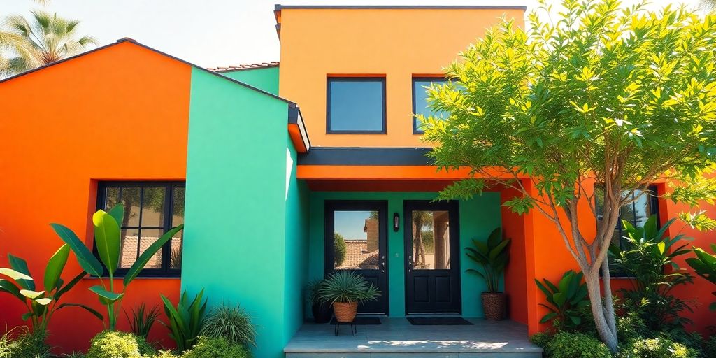
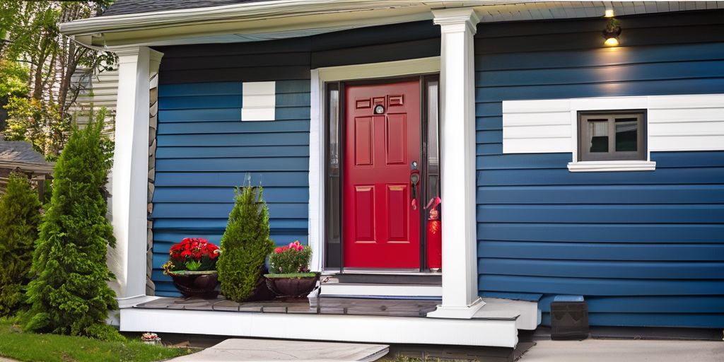
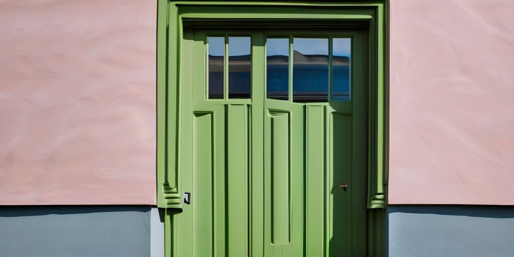
Every year, color trends become a hot topic as they shape the way we design our spaces. For 2024, the buzz is all about embracing bold and calming hues that reflect our mood and values. Whether you’re looking to refresh your home or just curious about what’s in vogue, the colors for 2024 promise to bring a fresh perspective. From the comforting tones of green to the playful splash of coral, there’s something for everyone. Let’s dive into the colors that are set to transform our homes and lives in the coming year.
Key Takeaways
- Tone-on-tone themes are making a comeback, offering a sophisticated look by layering similar shades.
- Green is becoming a go-to neutral, symbolizing sustainability and pairing well with a variety of colors.
- Soft lavender adds a whimsical touch, perfect for creating calming and serene spaces.
- Dynamic coral is all about energy and creativity, great for accentuating spaces with a pop of color.
- Warm, earthy palettes are trending, providing cozy and inviting atmospheres in homes.
The Rise of Tone-on-Tone Themes
Creating Sophisticated Spaces with Tone-on-Tone
Tone-on-tone design is all about using different shades of the same color to create a harmonious look. This approach brings a sense of calm and sophistication to any room. You don’t need to be a pro to achieve this style. Here’s how you can start:
- Pick a base color you love. This will be your foundation.
- Choose lighter and darker shades of this color to add depth.
- Mix in different textures like a plush rug or a sleek metal lamp to keep things interesting.
How to Layer Textures and Patterns
Layering textures and patterns can take tone-on-tone from simple to stunning. Here are some tips:
- Start with a neutral base, like a soft beige or gray.
- Add in textiles like a knitted throw or velvet cushions for warmth.
- Use patterns sparingly to avoid overwhelming the space—think subtle stripes or a gentle floral.
Tone-on-Tone for the Design Novice
If you’re new to design, tone-on-tone is a great place to start. Here’s why:
- It’s forgiving. You can’t really go wrong with shades of the same color.
- It simplifies the decision-making process. No need to worry about clashing colors.
- It allows you to experiment with different materials and finishes, giving you room to play and learn.
Tone-on-tone design is like a slow cooking process in a slow reno—it’s all about patience and letting the elements blend naturally over time. This methodical approach can transform your space into a sophisticated haven without overwhelming you with choices.
Shades of Green: A Sustainable Choice
Green is making a big splash in design trends for 2024. It’s not just about being eco-friendly, but also about bringing a sense of calm and balance into spaces. Green is versatile, offering a range of shades that can suit any style.
Using Green as a Neutral Base
- Dark greens, like forest or olive, can act as a neutral, grounding other colors in the room.
- Light greens, such as mint or sage, offer a fresh and airy feel, perfect for smaller spaces.
- Consider using green in unexpected places, like ceilings or trim, to add depth.
Pairing Greens with Other Colors
- Combine greens with warm tones like terracotta or mustard for a cozy vibe.
- Pair with blues or purples for a more sophisticated, cool look.
- For a bold statement, mix green with vibrant colors like coral or pink.
Designing with Dark and Light Greens
- Use dark greens to create a dramatic, moody atmosphere in living rooms or bedrooms.
- Light greens work well in kitchens and bathrooms, brightening up the space.
- Mix different shades of green together for a layered, textured look.
Embracing green in your design not only connects you to nature but also brings a refreshing and timeless quality to your home. It’s a color that can transform any space into a sanctuary of peace and tranquility.
Soft Lavender: A Touch of Whimsy
Incorporating Lavender in Bedrooms
Lavender is a dreamy choice for bedrooms. It’s soft and calming, making it perfect for creating a peaceful retreat. Here’s how you can use lavender:
- Paint the walls in a gentle lavender hue for an instant calming effect.
- Add lavender bedding or curtains to subtly introduce the color without overwhelming the space.
- Use lavender-themed artwork or throw pillows to tie the room together.
Creating a Tranquil Ambiance with Lavender
Lavender doesn’t just belong in bedrooms; it can bring tranquility to any room:
- Pair lavender with cream or gold accents for a harmonious look, as designers recommend.
- Introduce lavender through accessories like vases or candles.
- Consider lavender in your bathroom for a spa-like feel, especially if you’re planning a bathroom renovation.
Lavender in Modern Design
Lavender is not just for traditional designs; it fits modern aesthetics too:
- Combine it with sleek, modern furniture to create a chic, contemporary space.
- Use lavender as a backdrop for bold, modern art pieces.
- Pair lavender with neutral colors, which can enhance your space with timeless elegance.
Lavender’s versatility makes it a great choice for various design styles, whether you’re aiming for a cozy retreat or a sophisticated, modern look. Its ability to blend with other colors and textures makes it a favorite among designers.
Dynamic Coral: Infusing Energy into Spaces
Accent Pieces with Dynamic Coral
Dynamic Coral is like a burst of sunshine in your home. It’s a color that immediately catches the eye and can transform any room into a lively space. Consider using it in small doses to create a big impact:
- Throw pillows: Add a pop of coral to your sofa or bed.
- Artwork: A dynamic coral painting can be a stunning focal point.
- Decorative vases: Perfect for a splash of color on tables or shelves.
These little touches can make a room feel vibrant and full of life without overwhelming your senses.
Combining Coral with Other Hues
Pairing coral with other colors can create a harmonious and stylish look. Here are some combinations to try:
- Coral and Navy: This classic combo is both bold and elegant.
- Coral and Teal: Perfect for a fresh and tropical vibe.
- Coral and Gray: Offers a modern and sophisticated feel.
Mixing coral with these shades can add depth and interest to your space, making it both unique and inviting.
Coral for a Creative and Vital Space
Coral isn’t just for accents; it can be a central theme in your home’s design. Here’s how to make it work:
- Feature wall: Paint one wall in coral to draw attention and energize the room.
- Furniture: A coral sofa or chair can be a bold statement piece.
- Rugs and curtains: Use coral in textiles to tie the room together.
Coral is more than just a color; it’s a statement of creativity and vitality. It breathes life into spaces, making them feel dynamic and engaging.
By incorporating coral into your home, you embrace a color that’s not only trendy but also timeless. Whether it’s through small accents or larger design elements, coral can transform your space into a vibrant haven.
Warm, Earthy Color Palettes
Embracing Earth Tones in Design
Warm, earthy color palettes are making a big splash in 2024. These colors, like terracotta, muted greens, and rich browns, are all about bringing the comfort of nature indoors. They create a cozy, inviting atmosphere that just feels right. Here’s why you might want to consider these tones:
- Connection to Nature: Earthy colors help create a seamless transition between indoor and outdoor spaces, making your home feel more connected to the environment.
- Versatility: These tones work well in any room, whether it’s the living room, bedroom, or kitchen.
- Mood Enhancer: The warmth of these colors can make spaces feel more welcoming and comforting.
Embracing earthy colors in your home can transform a space, offering a warm and inviting environment that feels both timeless and modern.
Transitioning from Cool to Warm Palettes
Switching from cool to warm color palettes can seem daunting, but it doesn’t have to be. Here’s a simple guide to help you make the transition smoothly:
- Start Small: Begin with accent pieces like pillows, throws, or a small piece of furniture.
- Layer Gradually: Introduce layers of different textures and materials in warm hues.
- Balance with Neutrals: Use neutral tones like beige or cream to balance out the warmth and prevent it from overwhelming the space.
Earthy Colors for Cozy Interiors
Creating a cozy interior with earthy colors is all about balance and texture. Consider these tips:
- Mix Textures: Combine different materials like wood, wool, and leather to add depth and interest.
- Play with Light: Use lighting to highlight the warm tones and create a cozy ambiance.
- Incorporate Natural Elements: Add plants or natural materials to enhance the earthy feel.
These warm, earthy palettes are perfect for those looking to create a space that’s both stylish and comfortable. They’re versatile, inviting, and can make any home feel like a sanctuary.
Moody Black: The New Neutral
Using Black in Small Spaces
Black is making a bold statement in design, especially in smaller spaces like bathrooms and kitchens. Its ability to add depth and dimension is unmatched. Here’s how you can make the most of black in your home:
- Choose the Right Shade: Opt for a soft black, like charcoal or slate, which can make a space feel larger and more inviting.
- Contrast with Light Elements: Pair black with white or light wood to prevent the space from feeling too dark.
- Add Metallic Accents: Incorporate metallic fixtures or decor to add a touch of glamour.
Creating Mood with Dark Hues
Dark colors are not just about making a space look modern; they’re about creating a mood. Here’s why you might consider using dark hues:
- Enhance the Atmosphere: Dark colors can create a cozy, intimate setting, perfect for relaxation.
- Highlight Architectural Features: Use black to draw attention to unique architectural elements.
- Combine with Textures: Mix different textures, like velvet or leather, to add depth and interest.
Black as a Versatile Design Element
Black is incredibly versatile and can be used in various ways throughout your home:
- Accent Walls: A black accent wall can add drama and sophistication.
- Furniture and Accessories: Black furniture or accessories can ground a room and add a touch of elegance.
- Mix and Match: Combine black with other colors and materials for a balanced look.
Black is not just another color; it’s a statement. It’s about embracing the bold and the beautiful, transforming ordinary spaces into extraordinary ones. Whether you’re using it as a backdrop or a focal point, black can redefine your home’s aesthetic.
For more insights on how black can fit into your home’s design, consider the evolution of exterior paint colors and how neutrals have become a staple in modern design. If you’re interested in exploring how black can complement other colors, such as in brick painting aesthetics, you’ll find that it offers a timeless and elegant option.
Alluring Pinks in Contemporary Design
Sophisticated Shades of Pink
Pink is no longer just a "girly" color; it’s become a staple in contemporary design. Sophisticated shades of pink are being used in unexpected ways, adding a touch of elegance to modern spaces. From soft mauves to medium tones with brown undertones, these colors are versatile and stylish.
- Use pink as a neutral backdrop for other bold colors.
- Incorporate pink accents to add warmth to a room.
- Experiment with different shades to find the perfect balance.
Pink Beyond Traditional Uses
Gone are the days when pink was confined to nurseries and children’s rooms. Now, it’s being used in living rooms, kitchens, and even home offices. This shift reflects a broader acceptance of pink as a versatile color that can adapt to various design styles.
- Try pink cabinetry in the kitchen for a fresh, modern look.
- Use pink textiles, like cushions and throws, to soften a space.
- Consider a pink feature wall to create a focal point.
Combining Pinks for an Elevated Look
Combining different shades of pink can create a stunning, layered effect. This approach can add depth and interest to any room, making it feel more dynamic and inviting.
- Mix and match light and dark pinks for contrast.
- Pair pink with metallics for a touch of glamour.
- Use pink in combination with neutral tones to create a balanced palette.
Pink is making a strong comeback in contemporary design, proving that it’s more than just a color for the young at heart. Its versatility and ability to transform a space make it a favorite among designers and homeowners alike.
Soothing Blues: Timeless and Trendy
Popular Blue Shades for 2024
Blues are making a splash in 2024, with a variety of shades that are both calming and invigorating. Ethereal Blue is one of those hues that seem to transcend time, offering a serene vibe that’s perfect for any room. It’s like a breath of fresh air, bringing the calming depths of the sky and sea into your home. Here are some shades to watch out for:
- Ethereal Blue: A light, calming shade that evokes tranquility.
- Deep Navy: Perfect for creating a classic and sophisticated look.
- Soft Aqua: Adds a touch of freshness and vitality to spaces.
Designing Serene Blue Spaces
Creating a serene space with blue is all about balance. You want to ensure the color doesn’t overwhelm, but instead, complements your home. Here’s how you can do it:
- Layer different shades of blue for depth and interest.
- Use blue as a backdrop to highlight other elements in the room.
- Incorporate natural materials like wood and stone to add warmth.
When designing with blue, think of it as a canvas that allows other elements to shine. It’s about creating harmony and balance.
Pairing Blues with Warm Colors
Blues are incredibly versatile, and when paired with warm colors, they can create a dynamic and inviting space. Here’s how you can effectively pair them:
- Combine blues with warm earth tones like terracotta or golden apricot.
- Use blue as a neutral base, allowing warm accents to pop.
- Try pairing soft blues with warm metallics like brass or copper.
By thoughtfully pairing blues with warm hues, you can create a space that feels both cozy and fresh. Blues offer a timeless appeal, making them a great choice for any design refresh in 2024.
Feeling the blues? Embrace the calming power of blue hues in your home! Whether you want a classic look or something trendy, blue can transform your space into a peaceful retreat. Visit our website to explore how we can help you bring your vision to life with our expert painting services!
Wrapping Up the Colorful Journey
So, there you have it! The colors of 2024 are all about mixing things up and finding what feels right for you. Whether you’re into the calming blues or the lively corals, there’s something for everyone. These trends aren’t just about looking good; they’re about making spaces that feel good too. As you think about sprucing up your home or workspace, remember that these colors are more than just paint on a wall—they’re a way to express yourself and bring a little more joy into your everyday life. So go ahead, get creative, and let these colors inspire you to make your space truly yours!
Frequently Asked Questions
What are the top color trends for 2024?
The top color trends for 2024 include tone-on-tone themes, shades of green, soft lavender, dynamic coral, warm earthy palettes, moody black, alluring pinks, and soothing blues.
How can I use tone-on-tone themes in my home?
Tone-on-tone themes can be used by layering different shades of the same color in a room. This can be achieved through paint, furniture, and decor items to create a sophisticated look.
Why is green considered a sustainable color choice?
Green is considered sustainable because it reflects nature and growth. It can be paired with other colors to create a balanced and eco-friendly design.
What makes lavender a trendy color for bedrooms?
Lavender is trendy for bedrooms because it creates a calming and whimsical atmosphere. It adds a soft touch that promotes relaxation and tranquility.
How can dynamic coral add energy to a space?
Dynamic coral can add energy to a space by being used as an accent color in furniture or decor. Its vibrant hue brings warmth and excitement to any room.
What are some ways to incorporate black as a neutral color?
Black can be used as a neutral by incorporating it into small spaces or as an accent. It adds depth and versatility, making it a timeless choice for modern designs.

