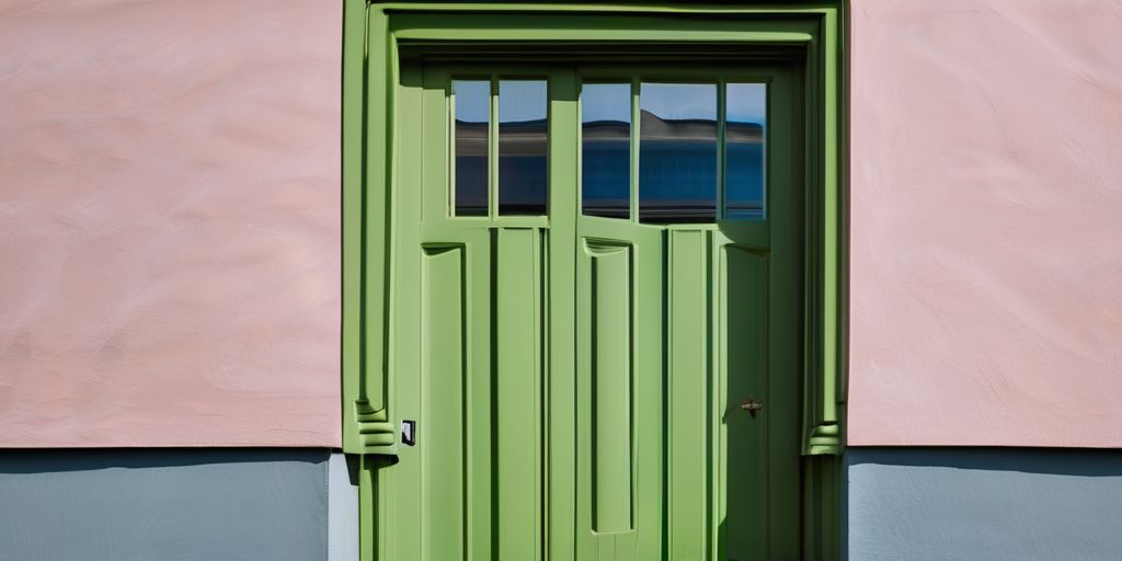
Every year, color trends capture our imagination and set the stage for fresh design ideas. As 2024 approaches, we’re seeing an exciting array of colors that promise to transform our spaces and moods. From calming blues to vibrant yellows, these hues are not just about aesthetics; they reflect our collective desires and cultural shifts. So, whether you’re planning a home makeover or just curious about what’s next, these color trends are sure to inspire.
Key Takeaways
- Tone-on-tone themes are gaining popularity, offering a sophisticated look with monochromatic palettes.
- Green shades continue to be a favorite, bringing a touch of nature into modern interiors.
- Blues are making a comeback, celebrated for their calming and serene qualities.
- Warm neutrals are being embraced for their ability to create cozy and inviting spaces.
- Bold yellows and oranges are set to brighten up spaces, adding a cheerful touch to decor.
The Rise of Tone-on-Tone Themes
Exploring Monochromatic Palettes
Monochromatic palettes are getting a lot of attention lately. They focus on different shades of a single color, creating a harmonious and cohesive look. These palettes offer simplicity and elegance, making them a top choice for many homeowners. Here’s why they’re so popular:
- Simplicity: Using one color family reduces the complexity of design decisions.
- Cohesion: Different shades of the same color naturally work well together, providing a seamless look.
- Versatility: They can be adapted to suit any style, from modern to traditional.
Layering Textures and Patterns
When you think of tone-on-tone, it’s not just about color. Textures and patterns play a crucial role in adding depth and interest. Here’s how you can make it work:
- Mix materials: Combine soft fabrics with hard surfaces to create contrast.
- Incorporate patterns: Use subtle patterns like stripes or checks to add dimension without overwhelming the space.
- Play with scale: Vary the size of patterns to keep the eye moving and engaged.
Creating Sophisticated Spaces
Tone-on-tone themes are perfect for those looking to create a sophisticated and calming environment. Here are some tips:
- Focus on balance: Ensure there’s a good mix of light and dark tones to avoid monotony.
- Use accents wisely: A pop of color in accessories can enhance the overall look without detracting from the theme.
- Consider lighting: Proper lighting can highlight textures and enhance the richness of the color palette.
Tone-on-tone themes are all about subtlety and elegance, offering a refined look that speaks volumes without shouting. Whether you’re revamping a cozy living room or a spacious hallway, these themes provide a timeless appeal that’s both modern and classic.
Shades of Green: Nature’s Embrace
Earthy Greens in Interior Design
In 2024, earthy greens continue to charm with their calming and natural vibe. These shades are perfect for creating a peaceful atmosphere in your home. From soft sage to deep forest greens, these hues can transform any room into a serene retreat. Consider using these colors for walls, furniture, or even small accents to bring a touch of nature indoors.
- Soft Sage: Ideal for bedrooms and living rooms.
- Deep Forest Green: Works well in studies or libraries.
- Olive and Moss: Great for kitchens and dining areas.
The Timeless Appeal of Green
Green has always been a favorite in interior design, thanks to its versatility and timeless appeal. It pairs well with a variety of other colors and can be used in both modern and traditional settings. Whether you’re aiming for a bold statement or a subtle backdrop, green is a reliable choice.
- Complements neutrals like beige and gray.
- Pairs beautifully with natural materials like wood and stone.
- Adds a fresh touch when combined with whites and creams.
Incorporating Green in Modern Spaces
Bringing green into modern spaces can be as simple as adding a few plants or as bold as painting an entire wall. Modern design often emphasizes open spaces and natural light, making green an ideal color to enhance these features.
- Use green as an accent color in furniture or decor.
- Consider a green feature wall to draw attention.
- Mix different shades of green for a layered look.
Green is more than just a color; it’s a way to bring the tranquility of nature into our daily lives. Whether through paint, plants, or textiles, incorporating green can create a harmonious and refreshing environment.
Embracing Tranquility with Blues
The Revival of Aquatic Blues
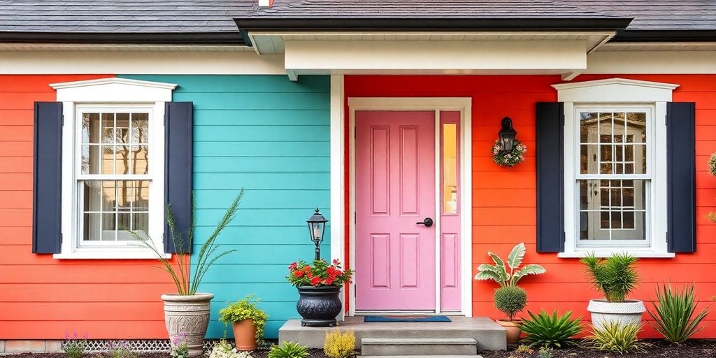
The trend of aquatic blues is making waves in 2024, bringing a sense of calm and serenity to our spaces. From soft teals to vibrant aquas, these shades reflect our growing desire to connect with nature and prioritize well-being. Aquatic blues are not just colors; they are a lifestyle choice that promotes peace and relaxation. When selecting a shade for your home, consider the light in the room. Natural light can enhance these hues, making them feel more vibrant and alive.
Blue as a Serene Backdrop
Blue has long been favored for its soothing qualities, making it an ideal backdrop in various settings. Whether you’re painting a bedroom or a living room, blue can create a serene environment that encourages relaxation. To achieve this effect, think about incorporating different tones of blue, such as navy or sky blue. This approach can add depth and interest to your space without overwhelming it.
Pairing Blues with Other Colors
Pairing blues with other colors can be both fun and rewarding. If you’re looking for inspiration, consider these combinations:
- Blue and White: A classic pairing that never goes out of style. It’s clean, fresh, and perfect for creating a coastal vibe.
- Blue and Yellow: This combo brings a cheerful and sunny feel to any room, reminiscent of a bright day at the beach.
- Blue and Gray: For a more modern and sophisticated look, blue and gray work together to create a sleek and stylish space.
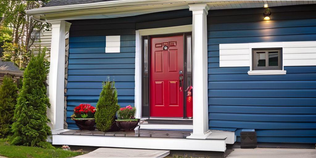
Incorporating these combinations can enhance the tranquility of blue while adding a touch of personality and flair to your home. If you’re in the Brantford area, consider visiting the Bell Homestead National Historic Site for some design inspiration; its historic charm might just spark an idea or two for your next project. Whether you’re updating your vinyl siding with popular blue-grey paint options or exploring new interior color schemes, blues are versatile and timeless.
Warm Neutrals: A Cozy Elegance
The Impact of LED Lighting on Color
LED lighting has really changed how we see colors in our homes. It often gives off a cooler light, which can make spaces feel less cozy. This is where warm neutrals step in. They balance out the coolness of LED lights, making rooms feel more inviting and comfortable. Think of soft beiges, gentle taupes, and warm grays. These shades don’t just add warmth; they also help create a soothing atmosphere.
Balancing Cool and Warm Tones
Mixing cool and warm tones can be a bit tricky, but when done right, it brings harmony to a room. Here’s how you can do it:
- Start with a neutral base, like a warm beige, on walls or large furniture.
- Add cool accents, like blue or green cushions, to create contrast.
- Use warm lighting fixtures to tie everything together and soften the overall look.
Creating Inviting Spaces with Neutrals
Warm neutrals are perfect for creating spaces that feel cozy and welcoming. Here are a few tips:
- Layer different textures, such as soft throws and plush rugs, to add depth.
- Incorporate natural elements, like wood or stone, to enhance the warmth.
- Consider the layout and make sure there’s plenty of seating to encourage relaxation and conversation.
A stroll through the Brantford Twin Valley Zoo might inspire the use of natural, earthy tones seen in wildlife habitats, bringing a touch of the outdoors into your home.
Incorporating these elements creates a space that not only looks good but feels good too. Whether you’re redecorating a living room or sprucing up a bedroom, warm neutrals offer a timeless elegance that’s hard to beat.
Radiant Sunshine: Yellows and Oranges
The Allure of Electric Amber
Radiant yellows and oranges are lighting up the design world in 2024. These sunny shades aren’t just about brightness; they bring warmth and vibrancy to any space. Electric Amber stands out as a favorite, capturing the eye with its bold, sunny glow. Whether it’s in textiles, wall colors, or decorative accents, this hue adds a touch of energy and positivity.
- Perfect for brightening up dark corners
- Complements natural lighting beautifully
- Works well with various textures and materials
Sunny Shades in Fashion and Decor
In fashion, these colors are making a statement too. Think of vibrant oranges in summer dresses or soft yellows in cozy sweaters. These hues transition seamlessly from home decor to personal style, offering a cohesive look that feels fresh and inviting.
- Yellow and orange fabrics create lively outfits
- Accessories like scarves and bags in these colors add a pop
- Ideal for both casual and formal settings
Captivating Spaces with Radiant Hues
When it comes to interior design, incorporating these colors can transform a room. They work well in living spaces, kitchens, and even bathrooms. Consider using yellow or orange as an accent wall or in small details like cushions or artwork.
- Use as accent colors to highlight specific areas
- Pair with neutral tones for balance
- Experiment with different shades for a layered look
Embrace the warmth and cheerfulness of yellows and oranges in your spaces. These colors not only brighten up your home but also uplift your spirit, making every day feel like a sunny adventure.
For those living in areas like St. Catharines, bright yellow vinyl siding is a popular choice, bringing a touch of sunshine to homes and boosting curb appeal.
Alluring Pinks: Beyond Traditional Uses
Sophisticated Shades of Pink
Pink is stepping out of its traditional roles and embracing more sophisticated shades. These hues are no longer just for nurseries or little girls’ rooms; they’re making a statement in modern design. Think of soft mauves and medium tones with hints of brown—these colors add a touch of elegance and warmth to any space. Here’s how you can incorporate them:
- Use pinks as a neutral backdrop in living rooms.
- Pair with metallic accents for a chic look.
- Layer different shades of pink for depth and interest.
Pink in Contemporary Style
In 2024, pink is not just a color; it’s a style statement. It’s being used in unexpected ways that challenge the norm. Whether it’s a bold pink accent wall or subtle pink accessories, this color is versatile and adaptable. Some ideas include:
- Creating a pink-themed gallery wall.
- Using pink in kitchen cabinetry for a fresh look.
- Incorporating pink in outdoor spaces for a pop of color.
Combining Pinks for Elevated Atmospheres
Combining different shades of pink can create an elevated and sophisticated atmosphere. This approach allows for creativity and personalization. Consider these combinations:
- Pairing blush pink with deep burgundy for a dramatic effect.
- Mixing pastel pinks with earthy tones for a calming vibe.
- Combining bright pinks with soft greys for a balanced look.
Pink is no longer confined to traditional uses. It’s a color that brings warmth and personality to spaces, making it a favorite in modern design. Embrace the change and let pink transform your environment.
The Drama Unfolds: Dark and Chic Hues
High-Contrast Colors for Balance
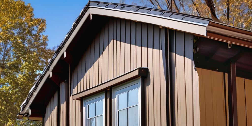
Dark hues are making a splash in 2024, offering a striking contrast to the lighter tones often seen in home decor. These shades bring a sense of depth and drama, creating spaces that feel both sophisticated and grounded. Think of rich navies, deep chocolate browns, and even intense blacks. Here’s why they work:
- They provide a perfect backdrop for lighter-colored furniture and accents.
- Dark colors can make a room feel cozier and more intimate.
- They help to highlight architectural features by drawing the eye to lighter elements within the space.
When considering dark hues for your home, it’s essential to balance them with lighter colors to avoid overwhelming the space.
The Allure of Deep Chocolate Browns
Deep chocolate browns are not just for your favorite dessert; they’re a hot trend in interior design too. These rich tones add warmth and a touch of luxury to any room. Here’s how you can incorporate them:
- Use them on accent walls to create a focal point.
- Pair them with lighter woods or metals for a balanced look.
- Consider them for upholstery in living rooms or dens for a cozy vibe.
This color pairs beautifully with natural materials, making it a popular choice for those looking to bring a bit of the outdoors inside.
Infusing Spaces with Mystery and Elegance
Dark colors are not just about making a bold statement; they also add a layer of mystery and elegance to your home. Here are some tips to infuse your space with these qualities:
- Combine dark walls with metallic accents to create a luxurious feel.
- Use dark hues in unexpected places, like ceilings or floors, for a dramatic effect.
- Balance the darkness with plenty of natural light to keep the space feeling open.
Embracing darker shades in your home can transform ordinary rooms into extraordinary spaces, full of character and intrigue. Whether you’re updating your living room or planning bathroom renovations, these chic hues offer endless possibilities for creativity.
Enchanting Purples: Versatility and Empowerment
The Mystery of Purple Hues
Purple, with its rich history and deep roots in royalty, continues to captivate designers and homeowners alike. This year, the color takes on new dimensions, offering a spectrum of shades from soft lilacs to deep plums. Purple’s ability to blend with various tones makes it a favorite for those looking to add mystery and elegance to their spaces.
- Lilac: Perfect for adding a subtle touch of color without overwhelming the space.
- Lavender: Offers a calming effect, ideal for bedrooms and relaxation areas.
- Deep Plum: Adds drama and sophistication, making it suitable for accent walls or statement pieces.
Creative Expression with Purples
The versatility of purple allows for a wide range of creative applications. Whether you’re looking to paint a bold statement wall or add a few purple accessories, the possibilities are endless. Here are some ideas:
- Accent Walls: Use a darker shade of purple to create a focal point in a room.
- Furniture: Incorporate purple through upholstered chairs or cushions.
- Decorative Elements: Add purple vases, lamps, or artwork to introduce subtle pops of color.
Empowering Spaces with Purple
Purple is more than just a color; it’s a tool for empowerment and self-expression. In the Brantford area, incorporating purple into your home can be as simple as choosing a vibrant shade for your vinyl siding to enhance curb appeal. This hue not only beautifies but also reflects personal style, adding a unique touch to any home.
Purple’s charm lies in its ability to transform ordinary spaces into extraordinary ones, offering a sense of empowerment and individuality.
Whether you’re drawn to the calming effects of lavender or the boldness of deep plum, purple’s enchanting qualities are sure to inspire and invigorate any space.
A Dedicated Trend Zone for Color Exploration
Creating Statement Walls
Creating a statement wall is a fun way to experiment with color without overwhelming a space. You can try bold paint colors, but wallpaper with unique patterns is also a great choice. Statement walls can act as a focal point, drawing attention and adding depth to a room. Here’s how to get started:
- Choose a wall that naturally draws the eye, like the one behind a sofa or bed.
- Decide on a color or pattern that complements the existing decor.
- Consider the room’s lighting, as it can affect how the color appears.
Using Color as an Accent
If you’re not ready to commit to a full wall, using color as an accent is a subtle way to introduce trends into your home. Accent colors can be used in various ways:
- Pillows and throws
- Rugs and curtains
- Artwork and decorative items
These small touches can make a big difference in the overall feel of a room.
Incorporating Trendy Hues
Keeping up with color trends doesn’t mean you have to redo your entire home. Instead, think about incorporating trendy hues in small doses. This approach allows for flexibility as trends change. Some ideas include:
- Painting furniture pieces like chairs or tables
- Using trendy colors in small rooms like bathrooms or hallways
- Adding trendy colors to outdoor spaces, like patios or garden furniture
Embracing new colors can refresh your space and bring a sense of vitality without a major overhaul. Whether it’s a bold hue or a subtle shade, exploring color trends can be both exciting and rewarding.
The Influence of Cultural Shifts on Color Trends
In recent years, colors have become more than just a visual element; they are a way to express personal identity. People are increasingly using colors to showcase their unique tastes and preferences. This trend has been driven by:
- The rise of social media platforms where individuals share their personal spaces and styles.
- A growing focus on mental health and the use of colors to influence mood and emotion.
- The desire to create spaces that are personal sanctuaries, reflecting inner worlds.
Colors are a language of their own, speaking volumes about who we are and what we value.
Colors have a profound impact on our emotions and can shape the atmosphere of a space. For instance:
- Warm colors like reds and oranges can energize and stimulate conversation.
- Cool colors such as blues and greens are often calming and promote relaxation.
- Neutrals can create a balanced backdrop, allowing for flexibility in design.
In the evolution of exterior house painting styles, the choice of color has always been key to achieving the desired aesthetic and emotional impact.
Cultural shifts play a significant role in shaping color trends. As societies evolve, so do their color preferences. Factors influencing this include:
- Globalization: With increased cultural exchange, colors from different parts of the world are being embraced universally.
- Historical Events: Major events can lead to a shift in color preferences, as seen in the adoption of more muted tones during economic downturns.
- Technological Advances: Innovations in lighting, like LED technology, have changed how colors are perceived, impacting choices in both home and fashion.
In regions like Cambridge, when selecting colors for vinyl siding, cultural and aesthetic considerations are crucial, ensuring the chosen palette resonates with local and personal tastes.
As we navigate through changing times, colors remain a constant companion, reflecting the ebb and flow of cultural and personal narratives.
The Intersection of Fashion and Interior Design
Color Trends in Fashion
Fashion and interior design have always shared a close relationship, influencing each other in various ways. Colors that dominate the runway often find their way into home decor, creating a seamless blend between personal style and living spaces. In 2024, expect to see a mix of bold and subtle hues that reflect both personal expression and broader cultural shifts. Here are some key points:
- Pastels like soft pinks and light blues are making a comeback, offering a gentle touch to both wardrobes and interiors.
- Earthy tones such as terracotta and olive green are popular, bringing warmth and a natural feel to any setting.
- Metallics, especially gold and silver, are being used as accents in both fashion accessories and home decor.
Bringing Fashion Colors into Homes
Incorporating fashion colors into your home can be a fun and creative process. Whether it’s through a fresh coat of paint or new textiles, there are endless ways to refresh your space. Consider these options:
- Use throw pillows or rugs in trending colors to add a pop of color to neutral spaces.
- Experiment with wall art that reflects the latest fashion palettes, creating a cohesive look.
- Textiles like curtains and upholstery can be updated to match seasonal trends, providing a quick style refresh.
The Synergy of Fashion and Decor
The synergy between fashion and decor is evident in how trends transition from one to the other. This connection allows for a dynamic and ever-evolving design landscape. For example:
- Patterns popular in clothing, like geometric shapes or floral prints, often appear in wallpaper and upholstery designs.
- The layering of textures, a staple in fashion, is mirrored in home decor through the use of different fabrics and materials.
- Fashion’s influence on color psychology plays a role in interior design, affecting how spaces feel and function.
Fashion and interior design are two sides of the same creative coin, each influencing the other in ways that are both subtle and profound. This relationship ensures that our living spaces are as stylish as the clothes we wear, reflecting personal tastes and current trends.
Fashion and interior design are more connected than you might think. Both fields focus on style and how things look, making them perfect partners. When you choose colors and patterns for your home, think about how they reflect your personal style, just like your clothing does. If you want to learn more about how to blend these two worlds, visit our website for tips and inspiration!
Wrapping Up the Color Trends for 2024
So, there you have it! The color trends for 2024 are all about mixing things up and trying something new. From the calming blues that remind us of the ocean to the warm neutrals that make any space feel cozy, there’s a lot to explore. And let’s not forget those bold pinks and sunny yellows that are sure to brighten up any room. Whether you’re planning a big home makeover or just want to add a splash of color here and there, 2024 is the year to let your personality shine through your color choices. So go ahead, grab that paintbrush, and make your space truly yours!
Frequently Asked Questions
What are the major color trends for 2024?
In 2024, expect to see a mix of bold and soothing colors. Popular shades include tranquil blues, earthy greens, warm neutrals, and radiant yellows and oranges.
Why are tone-on-tone themes becoming popular?
Tone-on-tone themes are popular because they create a sophisticated look by using different shades of the same color. This approach is easy for those new to interior design.
How can I use green shades in my home?
Green shades can be used in various ways, such as painting walls, choosing green furniture, or adding green plants to bring a touch of nature indoors.
What makes blue a good choice for home decor?
Blue is a timeless color that creates a calm and serene atmosphere, making it perfect for bedrooms and living spaces. It pairs well with many other colors.
How do warm neutrals enhance a room?
Warm neutrals add a cozy and inviting feel to a room. They balance out cooler tones and work well with various color schemes, making spaces feel more welcoming.
Why are pinks being used in new ways?
Pinks are being used in modern styles to add sophistication. New shades with hints of brown or mauve make pink more versatile and suitable for any room.
What impact do cultural shifts have on color trends?
Cultural shifts influence color trends by reflecting our values and moods. As society changes, color choices evolve to express personal identity and emotions.
How does fashion influence interior color trends?
Fashion trends often inspire interior colors, as both industries share similar themes. Popular fashion colors can become trendy in home decor, creating a cohesive style.

