Finding the right balance in brick painting aesthetics in Guelph involves a careful consideration of color combinations, finishes, surroundings, and texture techniques. By exploring these elements, you can enhance the visual appeal of brick surfaces while harmonizing with the environment. Let’s dive into the key takeaways from each section:
Key Takeaways
- Experiment with harmonizing neutrals, contrasting brights, and balancing pastels to create visually appealing brick painting aesthetics.
- Consider the impact of matte vs. glossy finishes, using satin for subtlety and high gloss for a bold statement on brick surfaces.
- When painting bricks, match the landscape, complement architectural features, and blend with neighboring buildings to maintain harmony in the surroundings.
- Explore texture techniques such as sponging for depth, stenciling for patterns, and layering for added dimension in brick painting projects.
Exploring Color Combinations
Harmonizing Neutrals
When it comes to brick painting, harmonizing neutrals can create a serene and timeless aesthetic. Neutrals are versatile and can easily adapt to various surroundings, making them a popular choice for homeowners.
- Understanding color psychology is essential when selecting neutral shades. Neutrals can evoke a sense of calm and stability, which is often desired in residential areas.
- Selecting suitable palettes that blend with the natural landscape of Guelph can enhance the overall visual appeal of a property.
- Consistency is key in achieving a cohesive look. It’s important to ensure that the chosen neutral tones are applied uniformly across the brick surface.
Neutral colors are not just about playing it safe; they offer a canvas for creativity and personal expression while maintaining a classic look that withstands the test of time.
While neutrals are generally safe, choosing the right shade is crucial. It should complement the neighborhood’s character and blend with the surroundings. This not only enhances property appeal and value but also allows for a subtle expression of personal style.
Contrasting Brights
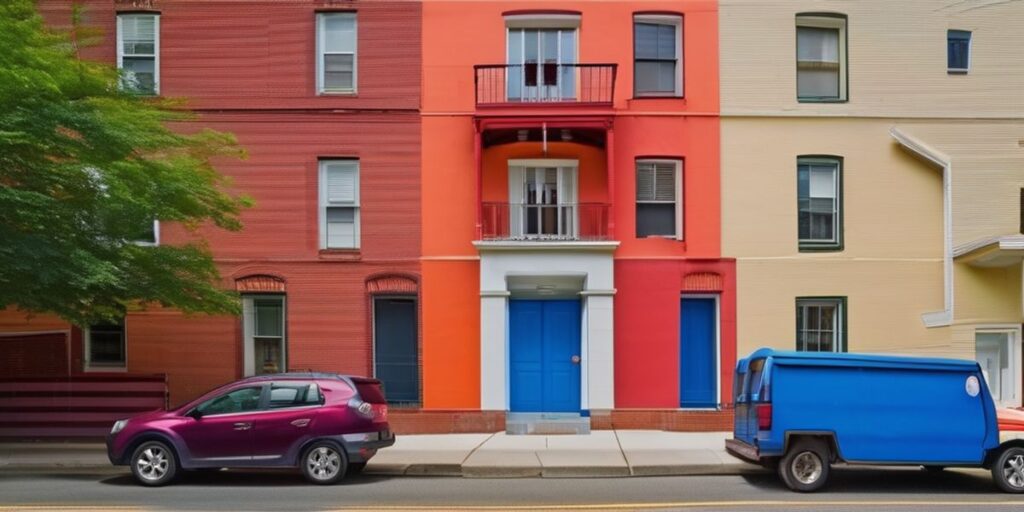
When it comes to brick painting, contrasting bright colors can create a visually striking effect that stands out in any neighborhood. While neutrals harmonize, brights demand attention and can be used to highlight architectural details or add a playful touch to your home’s exterior.
- Primary Colors: Bold reds, blues, and yellows can be paired to give a modern and energetic look.
- Complementary Colors: Using colors opposite each other on the color wheel, like purple and yellow, can create a vibrant contrast.
- Secondary Colors: Oranges, greens, and purples offer a more nuanced but equally impactful palette.
When selecting bright colors, consider the amount of natural light your home receives as well as the prevailing styles in your Guelph neighborhood. A brightly painted brick home near the Basilica of Our Lady Immaculate could become a local landmark in its own right, reflecting the vibrant community spirit.
Remember, the goal is to balance the brights in a way that complements, rather than overwhelms, the surrounding environment. It’s not just about the immediate visual impact; it’s about creating a cohesive look that enhances the overall streetscape.
Balancing Pastels
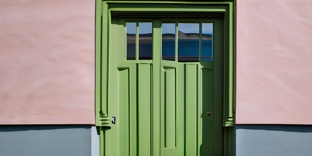
When incorporating pastels into brick painting, the goal is to achieve a soft yet vibrant aesthetic that complements the home’s character. Balancing pastels requires a thoughtful approach to ensure the colors do not become washed out over time.
- Selecting the right shade is crucial; it should be light enough to be considered pastel but saturated enough to maintain its hue against the brick’s texture.
- Consider the light exposure the brick will face; direct sunlight can cause pastels to fade more quickly.
- Pairing pastels with crisp white trim can enhance their delicate tones.
Maintaining the vibrancy of pastel colors is essential, especially for painted brick homes in Guelph. Regular maintenance and the right choice of paint can help preserve the aesthetic and historical significance of the property.
For a harmonious pastel palette, consider the following color combinations:
- Sky blue with soft yellow
- Mint green with pale pink
- Lavender with buttery yellow
Each combination provides a balance that is pleasing to the eye and can reflect the serene landscapes of Guelph, such as the tranquility found at the Royal City Park.
Choosing the Right Finish
Matte vs. Glossy
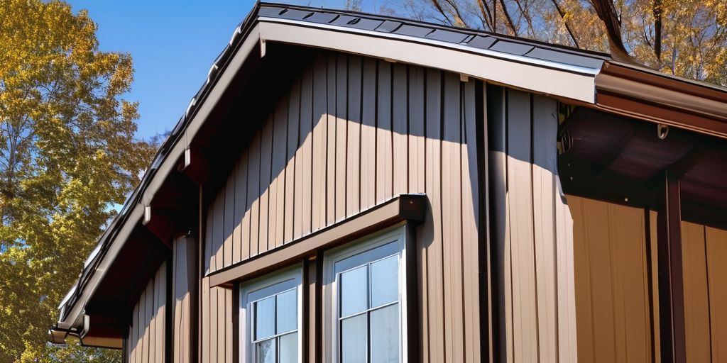
When deciding between a matte or glossy finish for brick painting, it’s essential to consider the desired aesthetic and practical longevity of the paint job. Matte finishes are favored for their non-reflective quality, which can hide surface imperfections and offer a classic, understated look. On the other hand, glossy finishes reflect light, enhancing color vibrancy and creating a bold statement.
- Matte finishes:
- Ideal for older bricks with imperfections
- Provide a soft, velvety appearance
- Less prone to showing smudges and fingerprints
- Glossy finishes:
- Suitable for bricks in good condition
- Offer a sleek, shiny surface
- Easier to clean due to their smoothness
Choosing the right finish can significantly affect the maintenance and aesthetic appeal of a brick surface. Consider the environment and the level of sheen you wish to achieve before making a decision.
While both finishes have their merits, the choice ultimately depends on the specific needs of the building and the preferences of the homeowner. In Guelph, for instance, a matte finish might complement the historic charm of the Basilica of Our Lady Immaculate, whereas a glossy finish could be more appropriate for a contemporary commercial space.
Satin for Subtlety
When it comes to achieving a subtle, refined look on brick surfaces, a satin finish can be the ideal choice. Satin finishes offer a low sheen that captures the essence of elegance without the glare of higher gloss options. This finish is particularly suited for homes that wish to exhibit a touch of sophistication.
- Durability: Satin finishes are known for their durability, making them a practical option for exterior surfaces.
- Maintenance: They are easier to clean than matte finishes, yet do not show imperfections as readily as glossy finishes.
- Versatility: This finish works well with a variety of color palettes, from muted earth tones to more vibrant hues.
Choosing the right paint finish is crucial for both durability and aesthetics. A satin finish strikes a balance, offering a surface that withstands the elements while providing a pleasing aesthetic.
In the context of Guelph, a city with a rich architectural heritage, selecting a satin finish can complement the historical ambiance. For instance, a property near the Basilica of Our Lady Immaculate could benefit from this finish, as it would blend seamlessly with the surrounding landmarks without competing for attention.
High Gloss for Impact
A high gloss finish on brick surfaces can dramatically alter the appearance of a building, providing a sleek and modern look. This type of finish is particularly effective in catching the eye and making a bold statement. It’s important to consider the practical aspects of a high gloss finish as well:
- Reflectivity: High gloss paints are highly reflective, which can be both a benefit and a drawback. They can help to brighten up dark areas but may also create glare in strong sunlight.
- Durability: These finishes are typically more durable and easier to clean, making them suitable for high-traffic areas.
- Application: Achieving an even high gloss finish requires careful application techniques to avoid streaks and brush marks.
When opting for a high gloss finish, it’s crucial to prepare the brick surface properly to ensure the paint adheres well and the final result is smooth and even.
In Guelph, the use of high gloss finishes can be seen as a contemporary contrast to the historic limestone architecture, such as the Church of Our Lady Immaculate. However, it’s essential to balance the impact with the surrounding environment to maintain the city’s aesthetic harmony.
Considering the Surroundings
Matching the Landscape
When painting bricks, it’s essential to consider the natural and built environment surrounding the structure. Choose landscaping elements that complement local landmarks, ensure durability, and enhance energy efficiency. This approach not only creates a cohesive aesthetic but also contributes to the property’s value and appeal.
Proper preparation, painting, and maintenance are crucial for lasting results. Here’s a simple guide to ensure your brick painting harmonizes with the landscape:
- Assess the natural surroundings for color cues
- Select hues that reflect the local flora and fauna
- Consider the changing seasons and how colors will adapt
Remember, the goal is to blend the building into its environment seamlessly, making it a natural part of the landscape rather than an imposition.
If you’re in Guelph, taking inspiration from the vibrant colors of the Royal City Park can be a subtle nod to the area’s beauty. By thoughtfully selecting colors and finishes, your brick painting project can enhance the visual harmony between your property and its surroundings.
Complementing Architectural Features
When painting bricks, it’s essential to consider the existing architectural features of a building. Choosing colors that complement these features can enhance the overall aesthetic and ensure that the paint job adds to the building’s character rather than detracting from it.
- Harmony with Historical Elements: For buildings with historical significance, select hues that respect the era and style.
- Texture and Trim: Pay attention to the texture of the brick and the color of the trim. A contrasting trim can highlight architectural details.
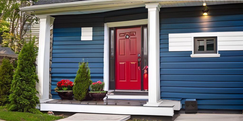
- Window and Door Accents: Use color to accentuate windows and doors, drawing the eye to these features.
When considering the architectural features, think about how the brick painting will integrate with the overall design language of the property.
In Guelph, the Basilica of Our Lady Immaculate stands as a testament to exquisite architectural design. While not every building can match its grandeur, using brick painting to complement the architectural features of your property can still make a significant impact.
Blending with Neighboring Buildings
When considering brick painting aesthetics, it’s essential to think about how your building will harmonize with its immediate environment. Blending with neighboring buildings creates a cohesive visual experience and respects the established character of the area. Here are some key considerations:
- Color Palette: Choose colors that complement the existing buildings nearby. This doesn’t mean you have to match them exactly, but aim for a palette that works well within the context.
- Style Consistency: If the area has a predominant architectural style, use paint textures and finishes that align with that style.
- Community Character: Reflect on the overall character of the neighborhood. Is it historic, modern, or eclectic? Your choice should enhance the collective ambiance.
It’s important to maintain a sense of unity within the community, while still allowing individual buildings to express their unique character.
In Guelph, the downtown area is a patchwork of historical and contemporary architecture. Ensuring that your building’s paint job is in harmony with this diverse landscape can contribute to the city’s charm without overshadowing its heritage.
Techniques for Texture
Sponging for Depth
Sponging is a painting technique that can add a unique depth and texture to brick walls. It involves using a sea sponge or a similarly textured synthetic sponge to apply paint in a non-uniform, organic pattern. This method creates a rich, tactile surface that can add character to any space.
Texture is key when sponging for depth. The natural irregularities of the sponge create a pattern that is difficult to replicate with traditional painting tools. Here are some steps to consider when sponging:
- Choose two paint colors that complement each other; one will serve as the base coat, the other as the sponge coat.
- Apply the base coat and let it dry completely.
- Dip the sponge lightly into the paint for the sponge coat, then dab off any excess.
- Gently press the sponge against the wall in a random pattern.
- Continue over the entire surface, periodically rotating the sponge to avoid repeating patterns.
When sponging, it’s important to work in sections and maintain a wet edge to avoid noticeable overlaps.
While sponging can be used on interior walls, it’s also an excellent choice for exterior brick surfaces, especially in areas where the texture can play with the light, such as near the Guelph Civic Museum. The museum’s historic brickwork could be enhanced with subtle sponging to highlight its architectural beauty without overwhelming it.
Stenciling for Patterns
Stenciling is a technique that can add intricate designs to brick surfaces, creating a unique visual appeal. Bold patterns can transform a plain brick wall into a statement piece, while subtler designs can add a touch of elegance without overwhelming the space.
- Choose a stencil design that complements the building’s style.
- Secure the stencil firmly to avoid paint bleed.
- Use a small roller or stencil brush for even application.
- Consider the scale of the pattern in relation to the wall size.
When selecting paint for stenciling, ensure it is appropriate for exterior use and can withstand the elements.
Stenciling allows for creativity and personalization in brick painting. Whether you opt for geometric shapes or floral motifs, the key is to achieve a harmonious look that enhances the brick’s natural texture.
Layering for Dimension
Layering paint on brick surfaces can create a rich, multidimensional effect that adds depth and character to a building’s exterior. By carefully applying multiple layers, each with varying opacity, homeowners and designers can achieve a textured look that stands out.
- Start with a base coat that will serve as the foundation for additional layers.
- Apply subsequent coats with lighter touches, allowing some of the underlayers to show through.
- Experiment with different brush strokes to enhance the texture.
Layering is not just about the visual appeal; it also contributes to the durability of the paint job. Each layer can help protect the underlying brick from the elements, ensuring that the aesthetic appeal is matched by practical longevity. In Guelph, where the weather can vary dramatically, this technique is particularly beneficial.
When considering layering techniques, it’s essential to think about the time and effort involved. This method requires patience and precision to ensure that the final result is both beautiful and enduring.
Remember, the goal is to create a facade that complements the building’s architecture and its surroundings. Whether it’s a modern home near the University of Guelph or a historic property downtown, layering can be tailored to suit any style.
Discover the art of transforming your home’s exterior with our expert techniques for texture at We Paint Siding. Our seasoned professionals specialize in spray painting and refinishing services that will rejuvenate your property’s appearance. Don’t settle for an outdated look or costly replacements when you can have a beautiful, durable finish at a fraction of the cost. Visit our website to explore our services, view stunning before and after transformations, and book your free estimate today. Let us help you bring new life to your home with a fresh, appealing texture that lasts.
Conclusion
In conclusion, finding the right balance in brick painting aesthetics in Guelph is a delicate art that requires a blend of creativity, practicality, and community considerations. By understanding the local context, embracing diverse perspectives, and engaging in open dialogue, we can create vibrant and harmonious spaces that reflect the unique character of Guelph. Let’s continue to explore the possibilities and celebrate the beauty of our city’s brick facades together!
Frequently Asked Questions
How do I choose the right color combination for brick painting in Guelph?
Consider harmonizing neutrals, contrasting brights, and balancing pastels to find the perfect balance.
What is the difference between matte and glossy finishes for brick painting aesthetics?
Matte finishes offer a subtle look, while glossy finishes provide a more impactful appearance.
How can I ensure that the painted bricks complement the surrounding landscape in Guelph?
Match the landscape by choosing colors that blend seamlessly with the natural surroundings.
Are there specific techniques for adding texture to painted bricks in Guelph?
Explore sponging for depth, stenciling for patterns, and layering for added dimension in your brick painting project.
Should I consider architectural features when selecting brick painting colors?
Complement architectural features by choosing colors that enhance the overall design of the building.
How can I blend the painted bricks with neighboring buildings in Guelph?
Create a cohesive look by selecting colors that harmonize with the surrounding buildings for a unified aesthetic.

