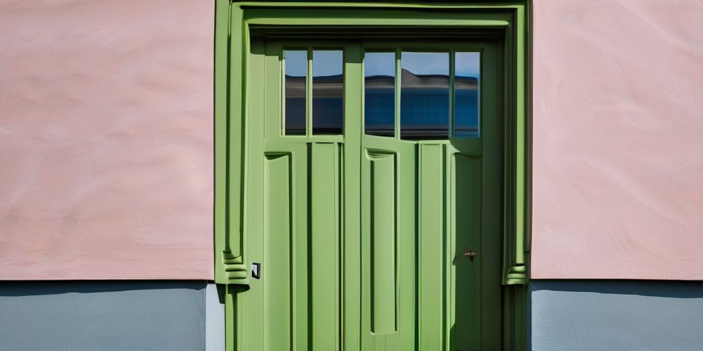
Color trends are always a hot topic as we look ahead to a new year. For 2024, the buzz is around bold shades, calming blues, and everything in between. Designers and color experts have already started naming their picks for the year, and it’s shaping up to be an exciting palette. Whether you’re planning a home makeover or just curious about what’s in vogue, these colors for 2024 promise to refresh your spaces and maybe even your mindset. Let’s dive into the hues that will be making waves next year.
Key Takeaways
- Tone-on-tone themes will create sophisticated looks with layers of texture and pattern.
- Shades of green are becoming the go-to for sustainable and versatile design.
- Soft lavender adds a whimsical and calming touch to various spaces.
- Dynamic coral is perfect for adding energy and warmth to modern interiors.
- Moody black offers a bold, dramatic option for those looking to make a statement.
The Rise of Tone-on-Tone Themes
Tone-on-tone themes are all about creating spaces that feel both sophisticated and effortless. By using different shades of the same color, you can craft a look that’s cohesive and elegant. This trend is perfect for anyone who wants to try something new without going too bold.
Creating Sophisticated Spaces with Tone-on-Tone
- Start with a base color: Choose a color you love and use it as the foundation for your room. This could be a soft beige, a calming blue, or even a gentle gray.
- Add depth with variations: Incorporate lighter and darker shades of your base color through furniture, rugs, and accessories.
- Mix in textures: Use different materials like velvet, linen, or wood to add interest without straying from your color palette.
Tone-on-tone themes offer a way to make your home feel both modern and timeless. By sticking to one color family, you create a space that feels intentional and well-thought-out.
How to Layer Textures and Patterns
- Combine different fabrics: Think about pairing a smooth silk with a chunky knit or a sleek leather with a soft cotton.
- Use patterned accents: A subtle pattern on a throw pillow or a rug can add visual interest without overwhelming your theme.
- Incorporate natural elements: Wood, stone, and plants can bring a touch of nature into your tone-on-tone space, adding warmth and texture.
Incorporating Tone-on-Tone in Small Spaces
- Keep it light: In smaller rooms, using lighter shades can make the space feel bigger and more open.
- Use mirrors: Reflective surfaces can help bounce light around the room, enhancing the tone-on-tone effect.
- Opt for multifunctional furniture: Pieces that serve more than one purpose can help keep the space uncluttered, allowing your color scheme to shine.
Tone-on-tone themes are not just a passing trend; they’re a versatile approach to design that can make any space feel more harmonious and inviting. Whether you’re redecorating a whole house or just a single room, this style has something to offer everyone.
Shades of Green: A Sustainable Choice
Green is making waves in design, not just for its aesthetic appeal but also for its eco-friendly vibes. In 2024, expect to see green being used in ways that are both innovative and sustainable.
Using Green as a Neutral Base
Green isn’t just a color; it’s a statement. When used as a neutral base, it offers a fresh alternative to traditional whites and grays. Here’s how you can incorporate green as a neutral:
- Forest Green: Deep and rich, this shade can serve as a grounding color in any room, offering a calming backdrop.
- Mint Green: Light and airy, perfect for creating a sense of spaciousness in smaller areas.
- Olive and Sage: These tones blend well with natural materials, enhancing the earthy feel.
Pairing Greens with Other Colors
Pairing green with other colors can create stunning visual contrasts and harmony.
- Combine with soft pinks or peach for a gentle, calming effect.
- Pair with bold blacks or whites for a striking look.
- Mix with yellows or golds for a warm, inviting atmosphere.
Designing Eco-Friendly Interiors
Green is synonymous with sustainability. Designing with green can mean:
- Choosing eco-friendly paint options, like those used for eco-friendly paint options for aluminum siding in St. Catharines.
- Incorporating recycled materials and sustainable furniture.
- Using plants not just for decor, but also to improve air quality.
The beauty of green lies in its versatility and its ability to bring a touch of nature indoors, creating spaces that are both beautiful and beneficial for the planet.
Soft Lavender: A Touch of Whimsy
Lavender is stepping into the spotlight in 2024, bringing a gentle touch of whimsy to our spaces. This color is all about creating a calming atmosphere, reminiscent of a serene lavender field swaying in the breeze. It’s perfect for those who want to add a bit of color without overwhelming the senses.
Infusing Calm with Soft Lavender
- Create a serene bedroom by painting the walls a soft lavender, which can help promote relaxation and a good night’s sleep.
- Use lavender in the bathroom to evoke a spa-like feel, making your daily routine feel like a mini retreat.
- Consider lavender for living room accents, like throw pillows or rugs, to add just a hint of color without stealing the show.
Lavender is more than just a color; it’s an experience. Imagine walking into a room and feeling instantly at ease, enveloped in a gentle hug of tranquility.
Perfect Spaces for Lavender Hues
- Bedrooms: Lavender is a natural fit here, encouraging rest and relaxation.
- Bathrooms: Pair it with white or gray for a clean, refreshing look.
- Home offices: A lavender accent wall can inspire creativity while maintaining a calm environment.
Combining Lavender with Bold Accents
- Pair lavender with a deep navy or charcoal for a sophisticated look.
- Add gold or brass elements to bring a touch of elegance and warmth.
- For a playful vibe, mix lavender with soft pinks or mint greens, as suggested by designers who recommend avoiding overwhelming color combinations.
Lavender isn’t just a color trend; it’s a versatile choice that can transform any space into a haven of peace and creativity. It’s time to embrace this gentle hue and see how it can make your home feel both unique and welcoming.
Dynamic Coral: Energize Your Space
Incorporating Coral in Modern Design
Dynamic Coral is all about bringing a burst of life and warmth to your home. This lively hue is perfect for those who want to make a statement. Dynamic Coral can be used in various ways to add a pop of color without overwhelming your space. Here are some ideas:
- Accent walls: A coral accent wall can transform a room, providing a vibrant backdrop that enhances other design elements.
- Furniture: Consider a coral sofa or armchair as a bold centerpiece.
- Accessories: Incorporate coral through cushions, throws, and artwork for a subtle yet impactful touch.
When using coral, balance is key. Pair it with neutral tones like white, gray, or beige to let the color shine without overpowering the room.
Balancing Coral with Neutrals
Coral is a strong color, so it works well when balanced with more subdued shades. Here’s how you can achieve that balance:
- Layering: Use coral as a top layer over a neutral base to create depth and interest.
- Texture: Combine different textures like velvet and linen in coral shades to add dimension.
- Proportion: Limit coral to 30% of your color scheme to maintain harmony.
Incorporating coral with neutrals can create a sophisticated yet lively space that feels both cozy and modern.
Coral Accents for a Vibrant Home
Adding coral accents can instantly energize your home. Here are some suggestions for incorporating this vibrant hue:
- Lighting: Coral lamps or pendant lights can add a splash of color without taking up space.
- Rugs: A coral rug can anchor a room and tie together various elements.
- Plants: Use coral-colored pots or planters to bring a fresh vibe to your greenery.
Coral is a color that exudes warmth and positivity. By thoughtfully integrating it into your home, you can create an inviting and dynamic atmosphere that reflects your personal style.
For those interested in painting exterior brick, consider how coral accents can highlight architectural features, adding a touch of vibrancy to your home’s facade. Additionally, understanding color psychology can help you use coral to evoke feelings of happiness and energy, making it a perfect choice for spaces meant to inspire and uplift.
Warm, Earthy Color Palettes
Embracing Earth Tones in Design
Earth tones are making a big comeback in 2024. These colors—think browns, creams, rusts, and muted greens—bring a cozy vibe to any space. They’re like a warm hug for your home. These tones are not just about aesthetics; they connect us to nature, creating a calming atmosphere.
- Browns and creams are versatile, acting as a neutral backdrop.
- Rust and muted greens add a touch of color without overwhelming.
- These shades are perfect for both modern and traditional spaces.
Creating Cozy Spaces with Warm Colors
When you want a room to feel inviting, warm colors are your best friend. Here’s how to use them effectively:
- Start with a neutral base like cream or taupe.
- Add depth with accents in rust or terracotta.
- Use textures—think woven throws or wooden furniture—to enhance the warmth.
By focusing on these earthy shades, your home can feel both stylish and comforting.
Earthy Hues for Every Room
These colors work in any room, from living rooms to bedrooms. Here’s why they’re so flexible:
- They adapt well to changing light, looking different but lovely throughout the day.
- Earthy tones pair easily with other colors, making them great for layering.
- They can make a small space feel larger and more open.
For those considering eco-friendly paints for aluminum siding, earthy tones like greens and browns are trending. They enhance curb appeal while supporting sustainability. Meanwhile, if you’re exploring a classic earth tone color palette, deep navy blue, cognac leather, and ivory shades create a warm, inviting atmosphere. Finally, when choosing the right exterior paint, consider how these colors interact with natural light and the mood they evoke in your space.
Moody Black: A Bold Statement
Using Black as a Main Color
Black is more than just a color; it’s a statement. When used as a main color in design, it can transform a space into something truly spectacular. Black walls, for instance, can add depth and drama, making a room feel both intimate and expansive. Here’s how you can use black effectively:
- Accent Walls: Use black on a single wall to create a focal point without overwhelming the space.
- Furniture: Incorporate black furniture pieces to ground a room and add sophistication.
- Flooring: Black tiles or dark hardwood floors can add a sleek, modern touch.
Embracing black in your home can be a bold move, but when done right, it adds a timeless elegance that few other colors can match.
Pairing Black with Metallics
Pairing black with metallics like gold, silver, or copper can create a luxurious and modern aesthetic. The contrast between the dark, matte finish of black and the shiny, reflective surfaces of metallics can be striking. Here’s how to do it:
- Lighting Fixtures: Choose metallic light fixtures against a black backdrop for a stunning visual effect.
- Decor Accessories: Metallic vases, picture frames, or candle holders can add a touch of glamour.
- Textiles: Use metallic threads in cushions or throws to subtly incorporate shine.
Creating Drama with Moody Black
Black is perfect for creating drama in any room. It’s a color that commands attention and can be used to highlight architectural features or create a cozy, intimate atmosphere. Consider these ideas:
- Ceilings: Painting the ceiling black can create a cocoon-like effect, especially in a bedroom or home theater.
- Trim and Molding: Highlight architectural details by painting trim and molding black against lighter walls.
- Artwork: Black frames or black and white art can add a classic touch.
Incorporating black into your design palette can make a bold statement. Whether you go all-out with black walls or just add a few black accents, this color is sure to make your space feel chic and sophisticated. As you explore the evolution of exterior house painting, consider how black can play a role in your home’s design narrative.
Alluring Pinks in Contemporary Design
Sophisticated Uses of Pink
Pink has grown up. No longer confined to nurseries or teenage bedrooms, pink is now a sophisticated choice for modern interiors. Think of pink as a versatile color that can add warmth and depth to your space. Here are some ways to incorporate pink into your home:
- Use pink as a backdrop in living spaces to create a calming atmosphere.
- Combine different shades of pink to add dimension and interest.
- Incorporate pink through textiles like cushions, throws, and rugs.
Combining Pinks with Other Colors
Pairing pink with other colors can create a striking balance in your home. Here are some combinations to consider:
- Pink and gray for a chic and modern look.
- Pink and navy for a bold contrast.
- Pink and gold for a touch of luxury.
These combinations can be used in various elements, from wall colors to furniture and accessories.
Creating a Modern Pink Palette
Designing a modern pink palette involves more than just choosing the right shade. Here are some tips to help you:
- Start with a neutral base, like white or cream, to let the pink stand out.
- Add layers of texture with different materials like velvet or linen.
- Use pink in unexpected places, like the ceiling or floor, for a unique twist.
Pink is not just a color; it’s an attitude. It brings a fresh and contemporary vibe to any space, making it a favorite among designers.
For those considering exterior options, choosing vibrant aluminum siding colors can enhance curb appeal while reflecting personal style and neighborhood trends. Popular choices include earthy tones, bold blues, and neutral classics. Meanwhile, for interior transformations, aluminum siding painting revitalizes homes with vibrant colors, emphasizing the importance of selecting the right hues and techniques for a professional finish.
Soothing Blues: Timeless and Tranquil
Designing Serene Spaces with Blue
Blue is a classic color that brings a sense of peace and calm to any room. It’s no wonder this hue remains a favorite for creating serene spaces. Blue rooms are both soothing and energizing, offering a perfect balance for relaxation and rejuvenation.
- Bedrooms: Consider soft, pale blues to create a restful ambiance.
- Living Rooms: Use deeper blues for a cozy, inviting atmosphere.
- Bathrooms: Light blue tiles can evoke a spa-like feel.
Pairing Blue with Warm Tones
While blue is inherently cool, pairing it with warm tones can create a harmonious and inviting space. Here’s how you can blend these colors effectively:
- Accent Pieces: Introduce warm-colored cushions or throws against a blue sofa.
- Wall Colors: Paint walls in a soft blue and add warm wood furniture.
- Artwork: Choose pieces with hints of orange or yellow to complement blue walls.
Blue as a Versatile Design Element
Blue’s versatility makes it a staple in many design schemes. Whether you’re aiming for a modern or traditional look, blue can fit right in.
- Modern Spaces: Use bold, vibrant blues for a striking effect.
- Traditional Settings: Opt for muted blues for a timeless appeal.
- Outdoor Areas: Blue works beautifully in gardens or patios, reflecting the sky and sea.
Blue is more than just a color; it’s a feeling. Its timeless nature ensures it will always be a part of our homes, offering a tranquil retreat from the chaos of daily life.
In a world filled with noise, finding calm can be a challenge. The soothing shades of blue offer a peaceful escape, creating a serene atmosphere in any space. Whether you’re looking to refresh your home or simply want to explore the beauty of color, we invite you to visit our website for more information. Let us help you transform your surroundings into a tranquil haven!
Wrapping Up the Colorful Journey of 2024
So, there you have it! The color trends for 2024 are all about mixing things up and bringing a fresh vibe to our spaces. Whether you’re into the calming blues or the lively corals, there’s something for everyone. These colors aren’t just about looks; they reflect our moods and the world around us. As you think about updating your home or workspace, remember that these hues can help create a space that’s not only stylish but also feels just right for you. Dive into these trends, have fun with them, and let your personality shine through your color choices. Here’s to a vibrant and colorful 2024!
Frequently Asked Questions
What are the popular color trends for 2024?
In 2024, expect to see bold colors being used as neutrals, soothing blues, and lively corals making a splash in design. These trends are inspired by nature and aim to bring warmth, tranquility, and energy into spaces.
How can I use tone-on-tone colors in my home?
Tone-on-tone themes involve using different shades of the same color to create a sophisticated look. You can layer textures and patterns to add depth, making even small spaces feel elegant and cohesive.
Why is green considered a sustainable color choice?
Green is linked to nature and sustainability, making it a popular choice for eco-friendly designs. It can be used as a neutral base or paired with other colors to create a refreshing and environmentally-conscious space.
What makes soft lavender a trendy color for 2024?
Soft lavender adds a whimsical touch to interiors, offering a sense of calm and relaxation. It’s perfect for bedrooms and bathrooms where a peaceful ambiance is desired.
How can I incorporate coral into modern design?
Coral is a vibrant color that can energize any space. Use it as an accent in furniture or decor to add a lively touch, while balancing it with neutral tones to keep the look modern and fresh.
What are some ways to use earthy color palettes in design?
Earthy colors like browns, creams, and muted greens create cozy and inviting spaces. They can be used in any room to bring warmth and a natural feel, complementing the outdoor scenery.

